Search My Blog!

Use the Search box below to find keywords that you're looking for quickly and easily!

Search Feature

Showing posts sorted by relevance for query wayne. Sort by date Show all posts

Thursday, February 8, 2024

Wayne's World

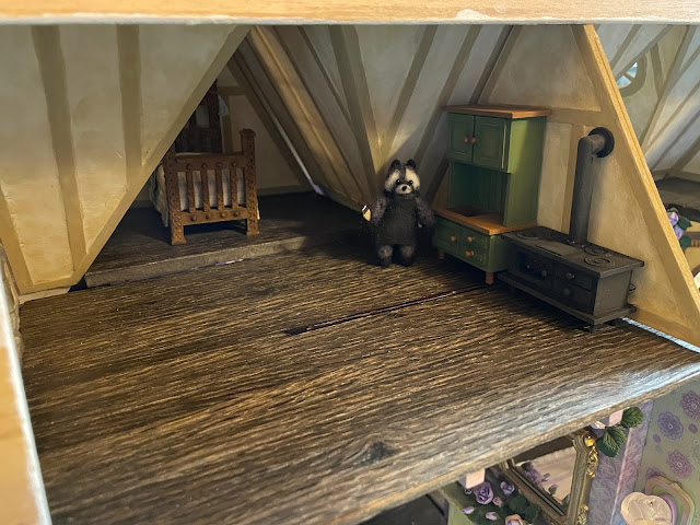
My regular readers will be familiar with our furry and friendly, handy and talented, resident raccoon craftsman, Wayne. His knowledge and willingness to tackle any task has been essential in making both the trunkhouse and the treehouse become a home. That is why I am delighted to report that this week it was finally time to begin working on Wayne's attic apartment!

Wayne

Wayne's Attic Apartment

To regular 1/12th folks, the attic space might feel a little petit. But to Wayne, at just 2-1/8" tall (to the tippy tufts of his ears), it's absolutely palatial! Sounds great, right?!? But how do I utilize and maximize every inch of this place and give Wayne a happy home? It's a challenge, and to further complicate matters, its my first real "less than 1/12th scale" project that isn't an all-in-one kit.

To help me visualize and get a feel for the actual amount of space Wayne has, I found measurements online for standard half scale furnishings. Then, I created shapes in those measurements that I could print out and lay out in his apartment.


Good plan, right? Except when I asked Wayne to come take a look. We both immediately saw a problem. The standard half scale stove measurements would require that Wayne stand on a step stool just to use it! That just wouldn't do! 

Maybe half scale wasn't quite right. And Wayne is certainly too big for 1/48th scale. He is basically 2/3 of half scale. That'll make your brain hurt! Whatever the actual scale ends up being, the facts are simple: Wayne is going to need an entire apartment of customized furnishings and accessories sized just for him. How fun! 😄

A half scale stove is just too tall.

Wayne and I took some measurements then went back to the drawing program. Our second set of models looked much, much better!


We felt confident in taking our measurements over to Design Space to create our first pieces! We started with the cooking stove, as it will also serve to heat the apartment. And alongside that we created Wayne's dry sink and hutch cupboard.

Here Wayne is installing the stovepipe and pot burners.

And here he's painting the hutch and dry sink unit before assembly.

Yippee! The first area of Wayne's apartment has it's furnishings and they're a great fit!


But there is still so much more Wayne needs to live a comfortable life! Kitchen table and chairs, comfy arm chairs and occasional tables, bookshelves, nightstand, rugs, mementos and good lighting... The list is long but now that we know how to scale things, everything in Wayne's World will fit him perfectly!


Back soon with more progress!

xo xo,

Jodi

Thursday, February 15, 2024

Setbacks and Revamps

Setbacks, difficulties, impediments, obstacles or failures. It doesn't matter which term you attach to any outcome that is other than the one you wanted. What's important is that you never give up. I believe if you learn anything it's still progress. I got many chances to practice that principle working on Wayne's furniture this week. At times I had to battle frustration and disappointment, but by reframing how I thought about each setback, I was able to revamp things and keep enjoying my mini time.


Things started off well with Wayne's kitchen table and chairs. I designed the pieces in Design Space and cut them from 2 mm chipboard. The table is a simple round table with the top in two pieces, one slightly smaller than the other, to create a step down effect. The base started out as a half circle and a bowling pin with some aspects sliced away. Can you see it? This gave it a unique shape. Opposing notches are cut into each piece so that they can slide together. The set went together great the first time and, most importantly, Wayne liked them. They'll need a bit of aging to give them character, but I'll wait and do that with the rest of the chipboard furnishings at the same time.


A perfect fit for Wayne!

For size perspective, Wayne is 2" tall and about an inch wide.

The next pieces I worked on, Wayne's leather club chairs, were a lot more complicated. I made it as easy on myself as possible by using the chair pattern I'd previously created for the Beachside Bungalow's bedroom. All I had to do was resize the pattern down to Wayne size. To give them club chair characteristics, I revamped the shape of the back of the chair. 

You can see below a good demonstration of the difference in scale from 1/12th to Wayne's scale, which I believe is close to 1/36th (G scale in model railroading).

Beachside Bungalow's bedroom
Wayne's chair back looks like a slice of toast, lol!
The brown pieces are cut from chipboard, the white from cardstock.

I finished the chair using the upholstery process from One Inch Minis and used tiny patterned/thin upholstery fabric. 


Some might call this good enough with fabric on, but Wayne requested leather.

Then came the challenging part: faux leather. While I've seen several YouTube Tutorials on how to achieve a faux leather look on upholstery and fabric, I didn't adhere strictly to any one method. Rather, I took aspects I thought made sense from some of them. All included applying a good coat of Mod Podge first to essentially seal and smooth the surface. I let that cure overnight before giving the chairs a light base coat of nutmeg brown. I wanted some of the yellow tones to show through.


Once dried I sponged on a darker brown mixed with satin glazing medium. It looked like we were getting somewhere!


But when I took photos, I noticed that when magnified by the camera close up, the fabric looked as though it had "pilled" up. Yikes!


Apparently, they needed a thicker coat of Mod Podge. That helped, but they still looked pretty flat and one dimensional. I was beginning to worry that all my time invested into these would result in one big failure. Ugh.


Finally, after adding highlighting and aging with a dark wash and dry brushing, I can live with them. The final sheen was achieved with a 50/50 mix of satin varnish and matte varnish. One was too shiny and one was too flat. Mixed in equal parts seems to have been the sweet spot. The yellow label Mod Podge was great as a pre-sealer, but made them look a little more like vinyl and less like leather. Which could work to your advantage on some pieces... say, pool inflatables? Thankfully, after I kept at them, Wayne is thrilled! He said he can't wait until he has a lamp that he can read by. I can't wait to catch him snoozing in one some afternoon!


The next revamp began when I had all of Wayne's furniture sitting together on my work table. The bed I had made for him last fall (when I made Roz and Rosario's beds) looked huge! And it kind of was. Not in its width or length, but definitely in height. And since the bed is going to be in a room with gabled roofs, height surely matters.

The big bed is a good length and width, but Wayne needs a stool to climb in!

Rather than lamenting about all the time it took to create the big bed (and to sew all the bedding), I decided to look at this as an opportunity to make another fun bed style perfectly sized for Wayne. I designed it from scratch in Design Space with layered head and foot boards and an inlay of carved tree branches. It took an entire day to design, cut, assemble, add bark to the branches, let dry and begin painting. I got nearly to the final phase of finishing before I found faults with my design. The footboard was a bit too tall, the legs were a bit too tall and any comfy looking mattress was going to block too much of the headboard inlay. It was hard to admit, but it just didn't work. Finally, I faced facts and realized that I liked the style of his big bed much, much better. 


This design still needs work.

Here are the big bed and the first revamp in the gabled bedroom...

Big bed

First prototype of the revamped bed. It measures 2" tall, 2" wide, and 3" deep.

Since I had resized the chair successfully I thought I could try resizing the big bed pattern into a more petit version. This meant reducing the height of the legs off the floor and the height of the head and foot boards. The width and length would remain the same and, hopefully, it would keep its character. I essentially just sliced off the legs, sliced out a section from all the head and foot board pieces and then welded them back together again. Et voila!

Wayne's big bed pieces in brown and the petit version in purple.

The revised bed seems promising! It looks a lot like the big bed and will be a much better fit for both Wayne and the gabled bedroom. With a little perseverance, by next week, it'll be just right. 


I'll leave you this week with a peek at the new entry step down and built in bookshelves that are a work in progress. Wayne is a bit of a pack rat so this space will fill up fast! I'm not set on the layout just yet, but I'm confident something will make sense, soon!


I hope you're revamping your "setbacks" and turning them into improvements, too!

xo xo,

Jodi

Thursday, March 2, 2023

Introducing Wayne, the Resident Craftsman

Before we get to the fairytale treehouse progress this week, I'd like to introduce you to our new resident, Wayne! Wayne has accepted the position of Chief Craftsman, where he'll be working 'on call' to help the girls and I make our creative building ideas come to life. Wayne will inhabit the third floor attic space, where he'll enjoy a cozy living space with all the comforts of home, as well as a craftsman's workshop. This adorable felted raccoon comes to us from MarysFairiesBoutique in New York State and he is so excited about exploring his new surroundings.

Wayne sees his new door for the first time.

He's also very excited to make the acquaintance of all the other folks in the mini neighborhood! Alice and Goldie are so thrilled that he is here, and wasted no time showing him around the treehouse and filling him in on their plans!


And speaking of plans, there is very little planning going on in this project. In fact, I seem to have spent the last week getting partially done on tasks for the first wall, then getting completely sidetracked with an idea for the interior kitchen wall! Let me share the happenings...

Wayne's front door interior. Watch your step Wayne!

I managed to finish Wayne's interior door which required creating a "stained glass" window and a ribbon hinge. That's where I had to stop once it was installed because I'll need to install the third floor before I can do more. That's still a ways down the task list. I used the Gelly Roll Glaze pens to create the polka dot look with clear as the filler and green for the polka dots. Wayne really loved it because he is a real artsy creative type!


Interior Kitchen Wall

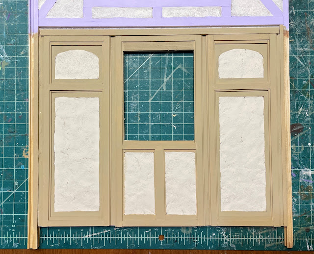
With timbers, paint and Paperclay applied.

Next, I made up a couple wall panels in Design Space and then cut them from chipboard on the Maker. To give them an interesting Tudor timber look, I layered 3/8" wide and then 1/4" wide timbers on top for a stepped look. I filled the space between them, under the window opening with timbers, too. I filled in the wall area with more Paperclay stucco. I chose a way more neutral paint for the timbers this time, and want to experiment with making knots and texture - soon. But first...


I wanted to attach the kitchen's pop out window to be sure all the wood trim and structure fit together. That lead to attaching the bedroom's pop out bed cubby, too. I also applied the glaze pens to some of the window features - it came out pretty well for this fantasy genre, though if I was doing a "serious" dollhouse project I'd need more practice.


And before I could take the next steps, I had an idea for the kitchen's interior wall. It is the wall that separates the kitchen from the living or Great Room as I am calling it. You'll see why later in the build.

But this idea was a very complicated one, and it is one that is still going to take me several days to finish. So I'll show a little peek for now and share the bulk of the work in my next post.

Kitchen divider wall.

Creating the oven door.

Happy March, everyone! Spring will be here before we know it! Unless you happen to live in the lower half of the planet. In that case, I bet you are looking forward to some cooler fall temperatures!

xo xo,

Jodi

Thursday, October 5, 2023

For The Boys...

While this Fairytale Treehouse Project is full of what is traditionally thought of as "feminine" aspects like flowers and frills, I didn't want to forget that there are a couple strong masculine personalities living here who bring just as much joy to the story. Wayne and Rozario, having strong opinions on their own design aesthetics, gave me plenty of ideas about what kind of beds they wanted to spend their nights in. This week's focus was for the boys. 

I first consulted with Rozario to give him a bunch of options for bed styles. He, being a beloved pet, wanted a pet bed. But not just any old fabric covered floor cushion. No. His bed had to befit a creature as special as he is. After all, you don't see pet dragons every day! I jotted down things that were important to him (comfort, grandeur, outdoor elements and, because of his limited bedroom nook's size, storage), then got to work in Design Space.


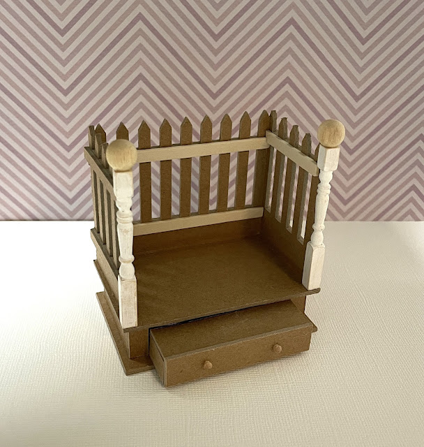
Rozario thought it would be really fun to pretend he was sleeping in the yard every night like a lot of dogs get to do. But he didn't want a dog house. A roof that is too close to his head can be dangerous, as he sometimes breathes a little fire when he snores. He discovered that the hard way, long story. He said a yard would have a fence, so he wanted some kind of fenced in feeling. His wish was my command! I created a three sided fence atop a princely platform.


In order to make it easier for Rosario's tiny legs to climb into bed, I made a pull out step drawer.


And included a storage cubby in the back of the drawer so he can store some of his favorite toys. I also added a couple fancy fence posts to the opening. He can pretend that he is guarded by powerfully magic staffs as he drifts off to sleep each night. 


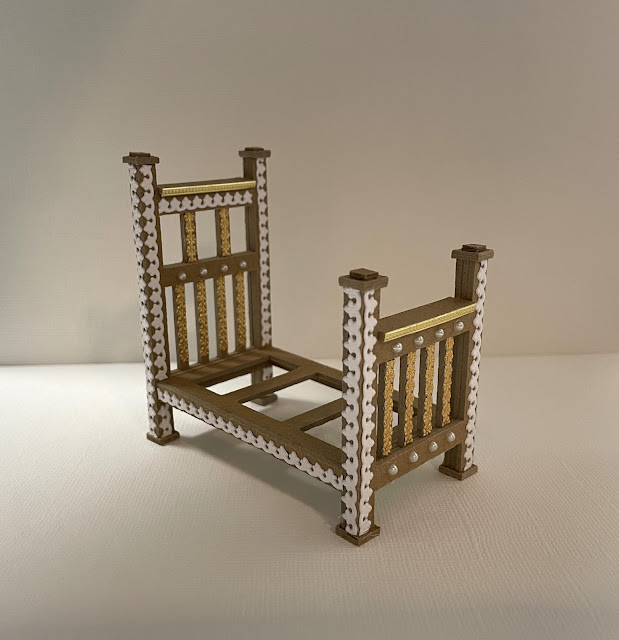
While I was busy on Rozario's bed, Wayne popped in to share his ideas. He's a busy guy so I gave him my full attention. Wayne told me his wishes were pretty simple: he's a craftsman, so he wanted Craftsman styled furniture but with a Tudor twist. And he'd love a comfortable mattress and bedding. Wow! I love a guy who knows what he wants! 

Designing Wayne's bed in Design Space was fun, especially since this was my very first piece of furniture in true half scale. It is so adorably tiny, but at just 2", so is Wayne!


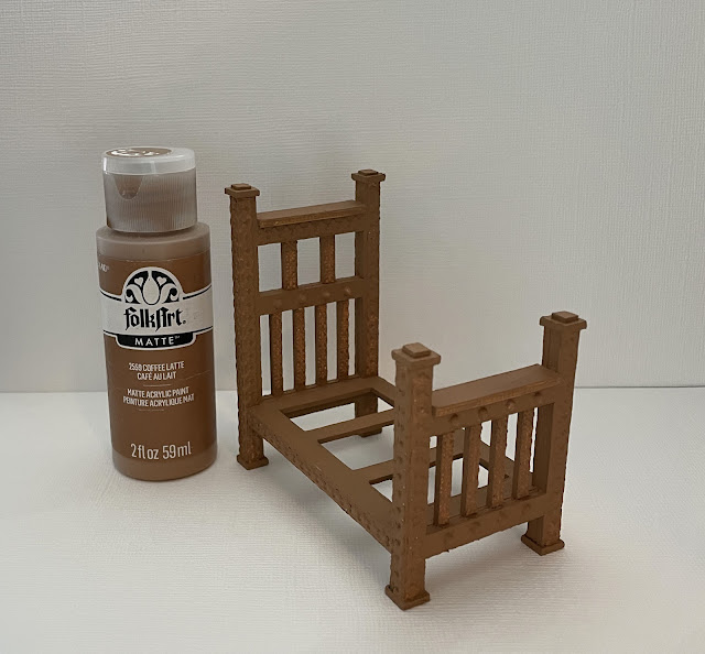
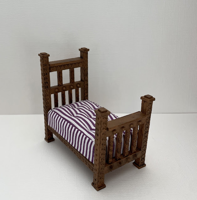
His bed is pretty simple: a three layered headboard, a three layered footboard and a simple mattress support piece to bridge them together. I couldn't resist including a few fun trim accents to the posts, which Wayne really appreciated. The assembled bed measures just 2" W x 3-1/2" L x 3-3/8" H.


Before I could begin to accentuate the beds with paint and detail, the boys needed mattresses. They got the same cushy models as the girls, only their ticking is a dark purple stripe with no hearts or flowers. Way more masculine! Rozario needs just slightly less sleeping room.


With that done I could get to the fun parts! I added many "carvings" to Wayne's bed to make the simple craftsman design feel more Tudor-like, as requested.


Then gave it a base coat of Coffee Latte.


Then a glaze coat with a darker chocolate color. Wayne loves his wood fairly unadulterated.


And with the mattress...


Let's see what Wayne thinks... Hooray! He approves! And with all the work he's got on his plate, he really appreciated my help.


But he said the ultimate test required him to take a nap. He'll get back to us shortly...


Rozario's bed needed a base coat of white.


After a little sanding of the rough spots, I gave it a base coat of Purple Cow followed by a couple coats of Amethyst metallic paint. Some areas were highlighted in Emperor's Gold paint, then I added metallic domes and Dresden trims, leaving them gold. Now it's fit for royalty!


 And with the mattress and the drawer step deployed.


But the final test was to present it to Rozario. He seemed thrilled, but it was hard to tell.


Because once I showed Rozario how the drawer worked and he saw the toys, the consultation abruptly ended. Time to play!


I am so happy that the beds for the boys were a success! And don't worry! I haven't abandoned the girls' and Roz's beds. It's just that for the sake of organization it seemed more efficient to get everyone's actual beds completed before I drug out the sewing machine to make all the bedding for everyone. Me + Sewing = Knots In My Stomach so any sewing project is always preceded by a little avoidance and/or procrastination. But, I'm determined to become a decent seamstress, one day, so off I go... Wish me luck! 

Back next week with, hopefully, something resembling bedding for everyone!!!

xo xo,

Jodi