Search My Blog!

Use the Search box below to find keywords that you're looking for quickly and easily!

Search Feature

Sunday, March 5, 2023

Attention MailChimp Email Subscribers

This post is for readers that subscribe by email and receive my MailChimp emails. Let me explain what that means and why it is necessary to address this function in a stand alone post...


Back before June of 2021, you could subscribe to Blogger blogs via a service called Feedburner. Essentially, by signing up, each time a new blog post posted to blogs you were signed up for, you would receive an email containing the post. A lot of readers found this convenient and blog authors loved that their readers would automatically be notified of a new post.

Blogger is a free platform hosted by the generous folks at Google. They host our interests and photos for free. A lot of us have been doing this for a long time, so the amount of things they store for us is HUGE! Pretty amazing, right? Well, there has to be a limit to the amount of resources that Google can allocate to Blogger, since it produces no revenue. That is why we see features disappearing slowly over time. In June of 2021, Blogger could no longer support email subscriptions through Feedburner, and so they provided bloggers the ability to export and save their list of email subscribers. This made it possible to employ other email services to notify subscribers, though it would be a manual process for the blog owners. I chose MailChimp because it was free for up to 2000 subscribers. That has now changed.

Sample Email Posts Sent

Beginning on March 10th, MailChimp will now only be free for email lists of up to 500 subscribers per mailing and 1000 emails per month. If your numbers are higher than that, the price goes up. Because my email list hovers around 1400 subscribers, and I generally send about four emails per month, my monthly fee to continue as I have will be $27/mo minimum. That is hard to swallow, since I make virtually no profit from my hobby.

I have spent a lot of time researching alternatives over the past month, and there just really aren't any. Not for free, at any rate. My best option, and the one that will serve my subscribers the best is to reduce the number of emails I send out. You see, 1400 emails per week go out, but only about 100 or so of the emails actually get opened and read. That's right - I have about a 7% read rate. To pay for 1400 subscribers when only 100 are reading is just not practical. So, what to do?

I have kept the actual readers. the ones who open the emails, from the last 90 days. It equates to about 200 or so. Beginning with this post, I will only be sending email posts to those subscribers. And, the emails will come from my personal gmail email. Gmail seems to be able to accommodate the number of subscribers and emails I send out each month and it is free. I am still keeping the option open for you to sign up for email subscriptions, you will just have to request that by sending me an email. And if you wish to stop receiving email posts, you'll have to let me know that, too: jodihippler@gmail.com

As ever, I am so delighted to connect with all of you through this amazing passion we share! You keep me inspired and motivated to reach my mini dreams, and I truly hope I do the same for you!

xo xo,

Jodi

Thursday, March 2, 2023

Introducing Wayne, the Resident Craftsman

Before we get to the fairytale treehouse progress this week, I'd like to introduce you to our new resident, Wayne! Wayne has accepted the position of Chief Craftsman, where he'll be working 'on call' to help the girls and I make our creative building ideas come to life. Wayne will inhabit the third floor attic space, where he'll enjoy a cozy living space with all the comforts of home, as well as a craftsman's workshop. This adorable felted raccoon comes to us from MarysFairiesBoutique in New York State and he is so excited about exploring his new surroundings.

Wayne sees his new door for the first time.

He's also very excited to make the acquaintance of all the other folks in the mini neighborhood! Alice and Goldie are so thrilled that he is here, and wasted no time showing him around the treehouse and filling him in on their plans!


And speaking of plans, there is very little planning going on in this project. In fact, I seem to have spent the last week getting partially done on tasks for the first wall, then getting completely sidetracked with an idea for the interior kitchen wall! Let me share the happenings...

Wayne's front door interior. Watch your step Wayne!

I managed to finish Wayne's interior door which required creating a "stained glass" window and a ribbon hinge. That's where I had to stop once it was installed because I'll need to install the third floor before I can do more. That's still a ways down the task list. I used the Gelly Roll Glaze pens to create the polka dot look with clear as the filler and green for the polka dots. Wayne really loved it because he is a real artsy creative type!


Interior Kitchen Wall

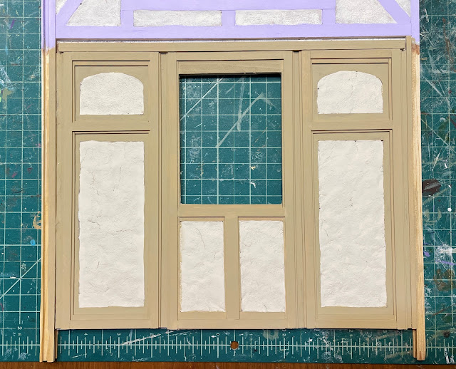
With timbers, paint and Paperclay applied.

Next, I made up a couple wall panels in Design Space and then cut them from chipboard on the Maker. To give them an interesting Tudor timber look, I layered 3/8" wide and then 1/4" wide timbers on top for a stepped look. I filled the space between them, under the window opening with timbers, too. I filled in the wall area with more Paperclay stucco. I chose a way more neutral paint for the timbers this time, and want to experiment with making knots and texture - soon. But first...


I wanted to attach the kitchen's pop out window to be sure all the wood trim and structure fit together. That lead to attaching the bedroom's pop out bed cubby, too. I also applied the glaze pens to some of the window features - it came out pretty well for this fantasy genre, though if I was doing a "serious" dollhouse project I'd need more practice.


And before I could take the next steps, I had an idea for the kitchen's interior wall. It is the wall that separates the kitchen from the living or Great Room as I am calling it. You'll see why later in the build.

But this idea was a very complicated one, and it is one that is still going to take me several days to finish. So I'll show a little peek for now and share the bulk of the work in my next post.

Kitchen divider wall.

Creating the oven door.

Happy March, everyone! Spring will be here before we know it! Unless you happen to live in the lower half of the planet. In that case, I bet you are looking forward to some cooler fall temperatures!

xo xo,

Jodi

Thursday, February 23, 2023

I Should Have Turned Left At Albuquerque

I know the feeling, Bugs! My mini time took a bit of a wrong turn this week on the Fairytale Treehouse project. It started off so well - I felt confident in the next steps. Then, just as the first task was finished, I realized that I didn't like it AT ALL!!!

Let me explain... I love the purple cubby, I love the traditional Tudor wall vibe, but not TOGETHER!!! Uh oh!


Let's talk first about how I got lost. Remember last post when I shared my idea for Alice's second floor bedroom wall? I had doodled on the wall in pencil?


Well, I liked the idea of timbers and thought it would be a wonderful look in a fairytale treehouse. I cut 1/8" x 3/8" basswood strips and made the timber framing. So far, so good...


Then, I painted the timbers in a lovely shade of brown. That was the first sign of the problem, only I didn't know it yet.


The fun part came next. In between the timbers, I got to brush on a little wood glue, then squish in Creative Paperclay. To give it some texture, I pounced it with a stiffly bristled paintbrush. I was diggin' it!


The Paperclay dried overnight, and then I aged it with brown water washes. Khaki/brown for the walls and more brown/brown for the timbers. I loved this too. 


Just not together with the purple! Rather than compliment one another, they compete for all the attention. I need cohesion.

I was experiencing cognitive dissonance.


I didn't feel too lost. I just backtracked to where I went wrong and made a hard left. It was easy enough to neutralize the "stucco" and "timbers" with off white water washes. I mixed up a lilac shade instead to apply to the timbers. Definitely more in line with the look I wanted for the girls' bedroom!


The new color on the timbers nicely complements the bed cubby's purple wallpaper patterns. I love it! It will look more in keeping with forest living, too, once I add some aging washes to bring down the newness.

Very cohesive.

Phew! Crisis averted! Now I could move on to the next task! My goal this week was to get this wall as far along as possible while I could still lay it down to work. I needed to cut another opening in the wall and that is so much easier with a flat surface.

The third floor/attic space will make the perfect loft space for another forest dweller, but he has requested his own private entry. I turned to my trusty Design Space program to help me with his door.


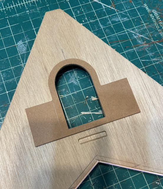
The doorframe is a wee 3" high with the actual door being 2-1/2" high x 1-1/2" wide. The assembly was cut using the Cricut Maker and is comprised of both chipboard and kraft board layers.

Chipboard is brown and Kraft Board is taupe.

I used the door piece as my pattern to trace the hole onto the Linfield kit's wall panel, then cut the door opening with the scroll saw.


Entry surround.

Next, I added paperclay "rocks" to the door frame surrounds and "carved stones" to the frame overlays. This was my first time doing this kind of rockery (I have used egg cartons and Magic Masonry in the past), and it was so fun! There are many applications for Creative Paperclay that I want to experiment with in the treehouse. I am sure I will figure out some kind of technique for it by the time I am finished with this treehouse, and when I do, I'll share some tips. 


Once the masonry was dry I applied an overall gray color wash, then added selective color washes to each individual stone using the colors from the color board in this project. Once I was happy with the look I sealed the rocks and exposed chipboard with Mod Podge. I will likely add grout and moss, but not until I am treating the entire wall as a whole. I think it will look more consistent that way.

I painted the chipboard and Kraft Board layers of the doors, then glued the layers together. I added Dresden and nail head details, and "plates" and doorknobs, then gave it all an aging wash. Here is how the door surrounds and doors look together.


Interior and exterior door frame surrounds and door.

There is so much more to be done to make the door functional. I will sandwich both the window glass and a fabric hinge in between the interior doors/wall as I install it. And our occupant will need a porch of some sort. I am still thinking through which tasks are better done before or after the wall has been attached to the treehouse structure.


You'll get to meet the new occupant soon - he is relocating to the Pacific Northwest from New York State! I hope he likes the rain, the gloom and the damp, and that he doesn't mind his temporary housing with Vera and Virgil. More to come...

All in all it was a great mini week in spite of a minor wrong turn. Luckily, I realized it before I ended up in a cave in Pismo Beach! 

xo xo,

Jodi