Search My Blog!

Use the Search box below to find keywords that you're looking for quickly and easily!

Search Feature

Thursday, April 20, 2023

Good Gaudy!

A fun play on words, dangerously close to blasphemous, but also true! Where else can you get away with so much embellishment, color, florals and texture but in a dollhouse? I took full liberties with every opportunity as I worked this week, and though it might seem gaudy to some, it's good gaudy when it comes to my idea of a fairytale treehouse! Let me share with you all the gaudy details! 😊


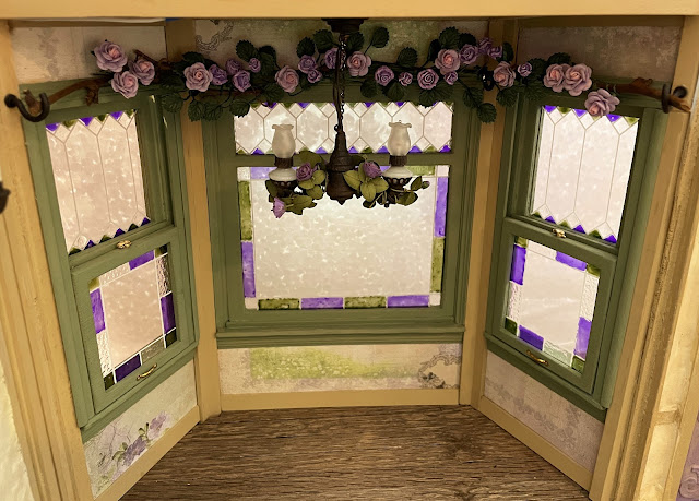
First, after installing the bay window's light fixture, it got me thinking about window coverings. I didn't need to actually cover the windows - it's not like the treehouse will be in a housing development where you can look out your window and see your neighbor brushing his teeth. So, maybe just a valence... a valance of flowers!


How it came to be... I had this polymer/resin rose vine floating around in my landscaping drawer for a very long time. It came as part of an ebay lot of furniture I bought a long time ago. Unfortunately, it was red, a color I haven't had the need for in any mini setting, so far. But, with a little paint, first a neutralizing coat of white and then a shade of petunia, it was perfect! I even changed the color of the leaves and applied a dirty water wash to bring out more of the vein details.


After its color transformation, Wayne found me a length of grapevine from a wreath in my stash, cut it to size for the bay window and then helped me wire the rose vine onto it.


Perfect shape for the bay!

Painted petunia then wiring to the grapevine.

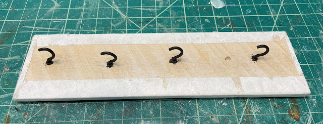
To hang it, he painted some gold cup hooks bronze, then installed them between the bay window frames.


I had some mulberry paper roses in my stash to supplement the vine. Originally white with pink centers, they got painted, too, then interspersed among the rose vine. I have left room on the ends so I can add hanging herbs and maybe a birdhouse when the full kitchen decorating happens. Viola! Fairytale window coverings!


Wayne and I continued working in the kitchen, adding the sconces on the sink wall and then another flower valence with mulberry paper flowers above the window alcove. I found some leftover leaves from a flower kit to add as filler.


I wasn't thrilled with my first idea for the kitchen's ceiling light. Luckily, Wayne found a metal fairy garden lantern in my stash he thought could work. He salvaged parts from a beat up ceiling fixture and came up with a scheme using a plastic bowl from my stash. He removed the metallic "flame" from the fairy lamp, drilled a hole into the plastic bowl, slipped it over the light fixture base (after painting it bronze) then glued it to the lantern. To help conceal the wire, I painted it green like a vine, wound it around the lantern and then wove in a mulberry paper flower. We make a great team! I hope it will provide enough light. Otherwise, we'll have to come up with something else to make an additional fixture. We'll test it once we start the ceiling installation process.

Rustic metal fairy garden lantern, lamp base removed from a
beat up ceiling fixture and a plastic bowl.


While I was working on lighting again, my "new old stock" ebay fixture for the girls' ceiling arrived in the mail. I had made a reasonable "make offer" offer and it was accepted. This time, I painted it green, wove a piece of grapevine wreath through the arms, then added more flowers. I think the girls should have plenty of light in their bedroom now.


Working out the 'Chicken and Egg Conundrum', it seemed prudent to stay focused on kitchen tasks this week. Before all the upper floors/ceilings can be installed the stove wall has to be fixed in place. Once the stove wall is in place it will be much more difficult to reach into the kitchen. Better to finish the big and challenging stuff before the walls/ceilings are in the way. That meant making the sink cabinet and shelving. 

As you can see, I went full Tudor "carving" mode on it. And boy was it fun! I cut it from chipboard on the Cricut Maker, then added basswood trims, Dresden and other embellishments from my stash. I made the tub sink from Kraft card with a chipboard base. 


Painting the sink cabinet in a neutral, monochrome color really took down most of the garishness, but still left such wonderful details. Especially once the dirty water wash settled into the crevices. The sink is painted in the same "bronze" effect as the lighting fixtures and then given an eyelet drain. The girls insisted on having lavender knobs.


For the countertops, we went with 1/8" x 1/4" "butcher block" stained with the Fred's Weathering Stuff. Wayne made rustic open shelving with scrap basswood to match. The rusty water pump brings fresh well water up for the girls to use whenever they need it. Goldie has been sorting through my stash of kitchen minis and doing a little shopping for some of the things I don't have, while Alice is looking for new places to adorn with flowers.


Wayne insists that before the kitchen ceiling/girl's bedroom floor can be installed, we have to install the great room's balcony. It has a support beam that the girls' floor needs to rest on. But it needed lots of prep work. First, Wayne and I added Betsy's "glue trick" bark in several layers, letting each one set before the next layer. Then we painted its base color, dry brushed highlights and added an overall dirty water wash. At that point it was ready to be attached to the balcony floor. You should have seen how Wayne expertly affixed the clamps - he is incredibly strong for such a little guy! Notice that we also applied Dresden "carving" to the face of the floor beams. Wayne has such creative ideas, but who knew treehouses could be so much work?


Once the balcony assembly was ready, it was time to add the rustic wood flooring strips. Wayne is a math whiz and taught me that for 90 degree cuts placed corner to corner like these, each floor board row progressively increases in length by the same amount as the width of each board: 1/2". His angles are pretty amazing, too, given the age of the wood and how brittle it is. Only the small folk using the balcony will ever get to see his craftsmanship once the balcony is installed.


He really likes the Fred's Stuff stain and used it on the floorboards, too.


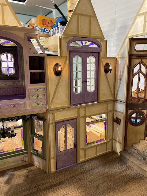
Before the balcony can be installed, we had to install the sconces that will live above and below it. It would have been harder for me to hold them in place while Wayne nailed them to the wall with the balcony in the way. The sconces on the first floor, flanking the staircase, went in easily enough, though the left sconce seems to be a wee bit crooked. Wayne says it adds character. Ah well, at least the lights still work!


Then we installed the balcony sconces on either side of the French doors. Our luck is holding out - these sconces are still working, too! đŸ€ž


You'd think at this point, after all our prep work, that we'd be free to get the balcony floor installed. Nope. Things just weren't quite gaudy enough yet! Once we'd experienced the fun, success and ease of beefing up the flower vines for the kitchen bay, we realized we'd need many more for the rest of the treehouse! Luckily, Christine, the owner of MiniatureCrush had just what we needed and shipped them out lightning fast! Now we can continue embellishing flower vines to drape over the balcony and other places before we take the next steps. Wayne is working on the landscape design while he waits for me to finish the flower vines. 

White flowers...

Become lavender.

So this, my friends, is where I'll leave off for this week. Next week, I hope to share all the florals, all the resources, all the progress and more Good Gaudy!

xo xo,

Jodi

Thursday, April 13, 2023

Red Light, Green Light

The construction phase of the treehouse had to come to a full stop for the planning and preparation of the lighting. It seemed smarter to have all of the fixtures ready to go as I reached the room/area where they needed to be installed, rather than stopping to prepare them each time I reached the point of needing them. So, out came my drawing paper and out came my drawer of ebay lot lighting fixtures. Luckily, I had plenty of them. I considered where lighting would be most effective, what type of lighting worked best for that space (i.e. ceiling, sconce, lamp etc...) and then looked at my options. Soon I had a plan, but I also had a whole lot of shiny gold finish to deal with. That just wasn't going to work for this fairytale treehouse.

Like me, you'd probably be surprised at all the components that make up dollhouse lighting. And that many of them can be removed. This makes things much easier if you intend to repaint them. Some of the parts, like the shades, can be swapped out or replaced with parts from other fixtures. Just take a good look at the fixture, play around with the parts so you see how they work. Also look at other things in your stash and apply a little imagination. I hope this post leaves your wheels turning with ideas and possibilities for reimagining your own lighting!

First light lit up in the treehouse!

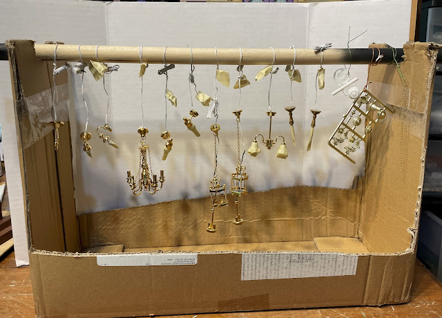
Once I knew which lights I was going to use, I started prepping them for painting. I removed all the parts that could be removed, then used masking tape to tape off the things that I couldn't. I also made a painting jig using an old box and closet pole so that I could spray the light fixtures while they hung. I didn't care about getting paint on the wires - they will mostly be hidden, anyway.

Makeshift spray jig. It looks like the gallows with all the fixtures hanging there.
Time to execute to the shiny gold finish!

Some parts removed, others unscrewed, many masked off.

I sprayed them first with a light coat of primer, then about an hour later, I sprayed them with several coats of flat black. I wanted to be sure I got all the areas of gold covered. I did miss some spots, but was able to cover them with flat black acrylic using a paint brush before the next step in the finishing process.


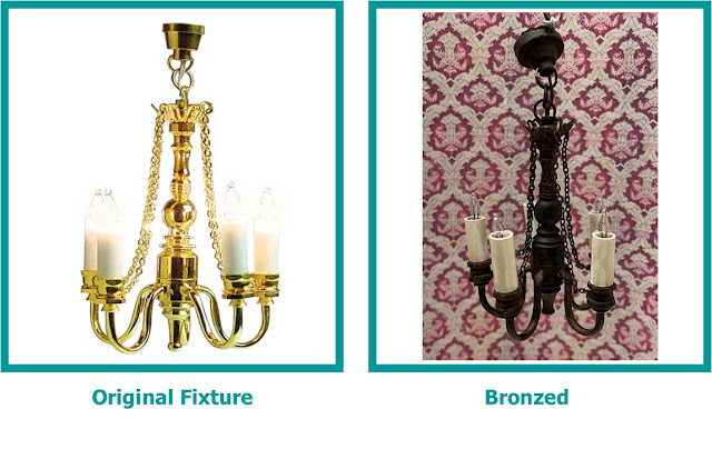
With the base color finished, the next step was getting the fixtures to look like what fairytale lighting looks like in my mind. Again, I go right back to the Tudor era. My impression from looking at photos was an iron metal with a bit of a rusty/bronzy effect. To achieve this, over the black base color I employed brown iron oxide, nutmeg brown and burnt sienna along with some glazing medium to lengthen the working time and add depth. I didn't get 'in progress' photos of the painting process because I have shared it so many times before: pounce, splotch until you like it. Instead, I'll share the before and after effects of the fixtures. I also want to say here that as an added detail, I created sconce plates for all of the sconces in Design Space, then cut them from 1.5mm chipwood and layered kraft card. Here are the shapes I used...

Chipboard Purple, Kraft Card Yellow

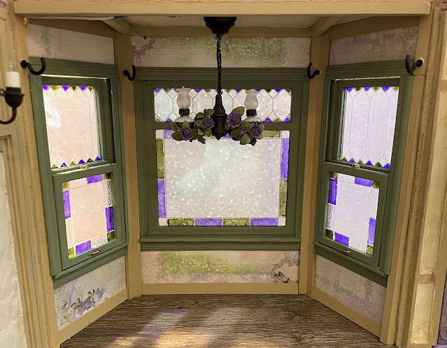
First is the kitchen's bay window fixture. It started as a Chrysolite kit, and after painting, it became a bronze fixture. At that point it was just screaming for flowers to be woven through its filigree. Luckily, I had some ready made purple flowers left over from the flower shops I finished last year.


Next is the staircase fixture. The bottom unscrews so that the center light insert can slide out to change the bulbs. This made it much easier to spray paint. I eliminated the plastic "glass" inserts as they were pretty cheesy and, I felt, unneeded. I actually made two of them but only used one for the photos.

The Great Room fixture's character really came to life once it had been bronzed. I really like the way it came out. I added ivory paint and some dripping wax to the candle slip covers to help make them a little less "stark white" and a little more "rustic" in character.


I originally thought I was going to use the next fixture in Goldie's bed cubby. Once I'd painted it, I'm not so sure. You see, I went with another paint finish for the other fixtures in the girls' room. I thought maybe I'd use this one for Wayne instead. It's one of the less expensive tulip shade lights where the shades aren't removable, so I taped over the shade for spray painting. I may still exchange the tulips for something else if a great idea hits me. Something crafty and customized for Wayne. And a bit less feminine.

The next set of lights are going to be used as open flame candlelight fixtures, say on fireplace mantles. One is sold as a set and just needed to be painted. The next is a single, originally sold as a torchiere lamp, but by removing the shade and adding a painted straw tube, becomes a candle.


Now, I'll move on to the sconces. There are lots of those. It just so happened that I had a ton of these in my stash of ebay lot fixtures and they seem to have been waiting for this project. I'll start with the Meyers Wall Light. It is unique in that the shade is removable and it can be turned upside-down. I also replaced the pea bulbs it came with for candle flame bulbs, then created candle bulb tubes to fit over the bulbs. With the arched Tudor style sconce plates, it totally changed the look of the fixtures.


Speaking of bulb changing... Did you know that your fixtures' bulbs can also be changed out? Whether they have bi-pins or screw bases, you can switch between candle flame or more traditional looking bulbs. This provides additional possibilities to match the lighting to the time period or genre of your build.


These shaded fixtures already had an interesting shape, so by simply changing the finish, switching to fancier scalloped shades and adding sconce plates, they really look lovely.

Other than painting and adding double layer sconce plates, these hurricane glass sconces didn't need much to fit into the story.

These Heidi Ott fixtures were already pretty detailed and spectacular. They seem perfect for a fairytale treehouse. Because they are going to flank the staircase, I wanted to use the color tones in the staircase wall of windows to tie everything together. So rather than a bronze finish, I painted them to look a little more like carved wood.


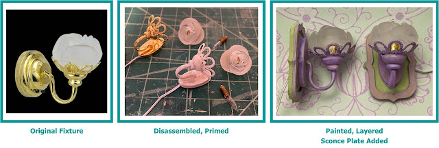
Now we come to the girls' room lighting. This is definitely not the place for bronze or wood colors, no. This is the purple place, the green place, the fairytale space. And what better to light a fairy space than flower sconces? For these ornate sconces, I removed the screw-off acrylic flowers, removed the bulbs, primed and then painted with the room's colors. These will flank the future fireplace.


For the girls' cubbies, they needed reading fixtures. What started out as a modern metal fixture has been magically transformed to something more sweet and fairy like. Simply by switching shades to scalloped ones, painting and adding sconce plates, they are totally different. An added benefit to sconce plates is that they help distribute the weight of the fixture, helping it to adhere and stay put on the wall. More gluing area is always better!


Of course, once I had the lights ready I couldn't wait to get started installing them! I started with the kitchen bay fixture as this was the best time to reach in - while the kitchen's ceiling was out of the way. It's such a relief once the fixture is installed when the lights are still working!


Next, I installed the sconces that flank the future sink. I really like the Tudor style sconce plates!


I didn't chronicle making the above stove light fixture because it was a total afterthought. It is made from three single candle flame bulbs stuffed inside a necklace container pendant and then hung from a hook on a sconce plate.


This post is getting ridiculously long, so I'll only torture you with one last install - the girls' cubby reading lights. They are so excited about reading in their beds that they are already tearing apart my fabric drawer looking for the perfect bedding material!


Because of this little lighting side adventure, my progress on the actual structure of the fairytale treehouse came to a stop. But now, as construction resumes, each time I reach a new area and need to install a fixture, it'll be green lights all the way!

Hope you found something useful here to employ in your own magical creations!

xo xo,

Jodi