Oh, I hope you aren't looking to me for the answer, because I don't even know what I'm doing... yet! I have this idea of the finished look in mind, but I'll be darned if I know what steps to take to get there! And then, to make it even more challenging, my lizard brain keeps trying to set me to task on all the "usual" dollhouse building processes. Like starting to cover every wall in wallpaper. No!!! Completely wallpapered walls is not the kind of fairytale treehouse my heart is dreaming of! And when you top that off by going rogue on the dollhouse kit instructions, then you have really made a job for yourself. My "no plan" plan might be way more trouble than I anticipated...
 |
| Alice's Bed Cubby Pop Out |
So, I started with the things I DID KNOW that I wanted. The girls' cubbies needed to be very fairytale princess, but unique, per their request. Their color choices were primarily purple and green. Pink, they said, is apparently "So Cinderella", and "So Predictable". Okay, no pink. Too bad. I LOVE pink!
The girls picked this paper pack and asked if I could incorporate lots of it in the treehouse without making it look too much like a dollhouse. Uh, I can try...The hues in the paper pack became the color palette for the pop outs. It's just coincidence that the pad is named Alice...
They did say I could include all the frilly details I could come up with, so I dug through my drawers for things like Dresden appliques, tin flowers and leaves, metal "nail heads", beads and pearls and fretwork metal pieces. I painted all the appliques so the detail would remain a bit more textural and subtle.
The inside of Alice's cubby got a two wallpaper detail with bright trim work. She is very excited thinking about how her bed full of pillows is going to look!
Goldie's pop out has a bit less frill because the kit's window was already nicely detailed. Since I turned it into a pop out from the original flat wall window, I had to create the inside trim. It still needs a little work but I'll wait for ideas to hit me.
These are the papers Goldie picked for her cubby...
Later, when the dirty water washes come along to tone down the brightness, I am pretty sure the look will be more "deep woods princess" than "Little Tyke Princess".
A while back Emily shared her experiment using Sakura Glaze pens for mini stained glass windows. They turned out great and it looked fun to try. I just love the acetate window designs that came with the Linfield kit, and they have great potential for a really pretty stained glass look. To start small and slow, I used the clear glaze pen and with a little practice, the windows could become stunning. I started with the SAKURA Glaze 3D Ink Pen - Jewels pack and am awaiting delivery of the Sakura Glaze 3D Ink Pen - Brights pack. I'll let you know how it goes.
Since the kitchen pop out was not part of the original kit, I had to make the window myself. Luckily, there was a section big enough from the kit's acetate sheet to cut it from. I used the white colored glaze pen to try and mimic the kit's acetate windows. The lines are much thicker, but in this fantasy theme, I am happy enough with the result. Here it is in the painted and detailed pop out window. Getting the "glaze" to go where you want it to go is a bit tricky at first, but soon, you get the hang of it.
And here is the right wall with two of the pop outs ready for installation. First, though, this wall will be getting one more feature - a door opening into the third floor/attic space. It is only going to be big enough for the smallest of tree dwelling forest creatures. More on that later...
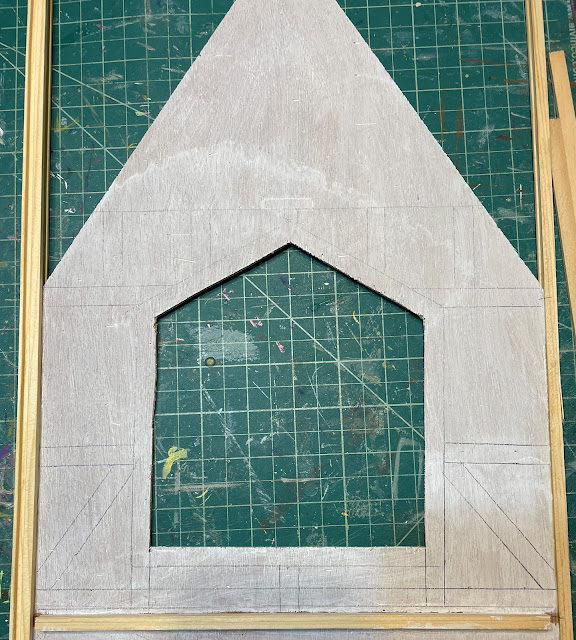
And more decisions need to be made about just how to make a fairytale treehouse. Some wall doodling is helpful in visualizing just what might look right...
 |
| Can you see the faint pencil lines? |
 |
| A closer look. |
I think I have a direction, and after I prepare the house for a weekend full of gathering family, I'll get to play with it some more! All your creative suggestions will be most welcome and any I think I can achieve, incorporated!
Have a great weekend!
xo xo,
Jodi


