Search My Blog!

Use the Search box below to find keywords that you're looking for quickly and easily!

Search Feature

Thursday, August 4, 2022

My Recipe For A Kitchen

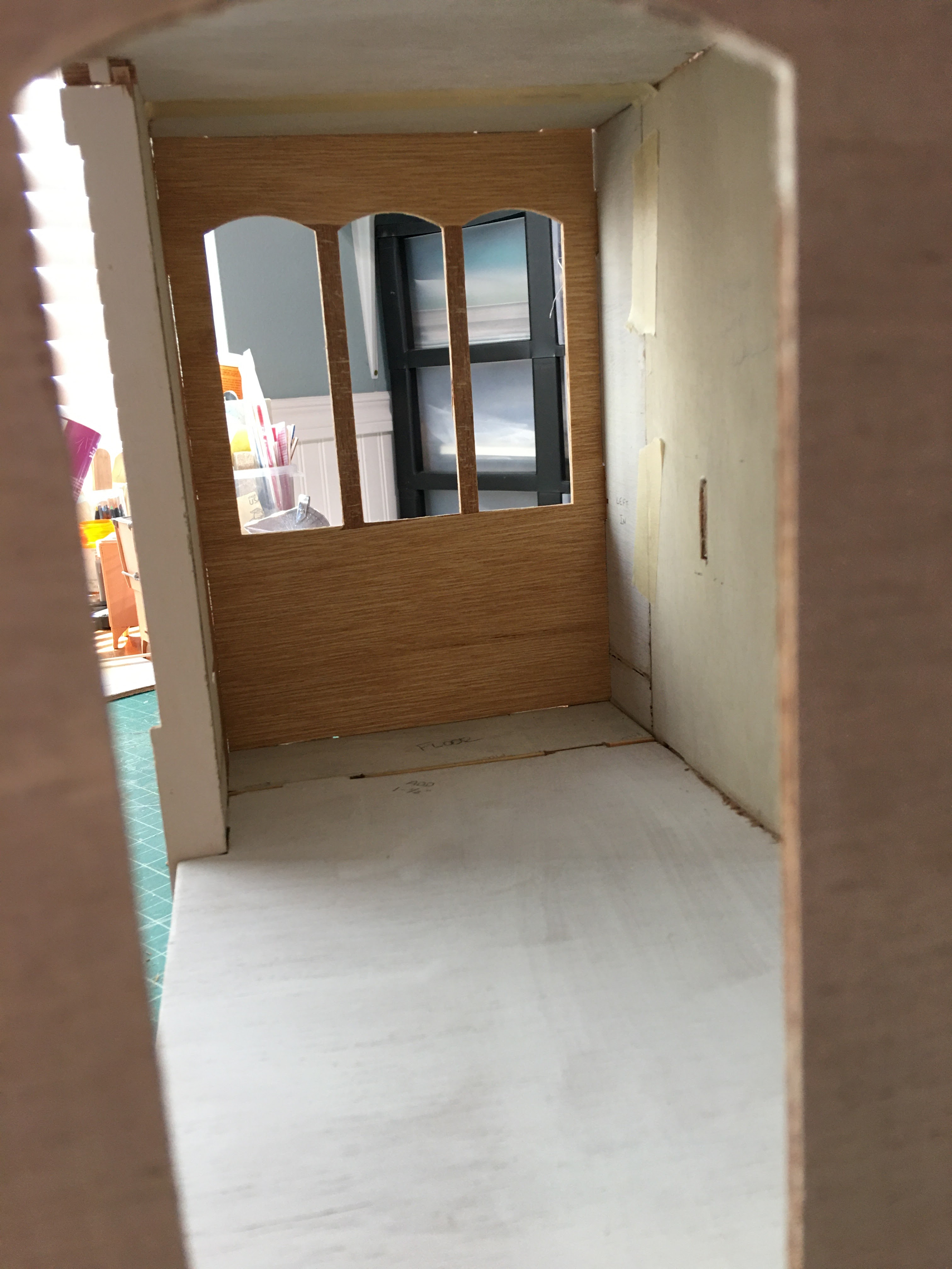
Just last week I had no idea what I was going to cook up with this kitchen. But once I got out the Grand Hotel paper pack to assign the patterns and colors to each of the remaining rooms in the Willowcrest, my design choices for the kitchen came cascading into my mind. I liked them so much, I began to salivate! This is definitely not the paper I ever thought I'd be using in the kitchen, but sometimes, it's fun to fix something new!

Before I could really get going on anything, I needed to finalize my cabinet and appliance layout. Those would dictate every other thing I did in this compact room. I got out the ruler and graph paper to measure exactly how many inches I had to work with, then took them over to Design Space to design the cabinets. In cooking, it's what you call mise en plase. And I really like it when me is in place! I seem to be making a habit of using chipboard cabinetry in my kitchens, but I enjoy making them so much! Maybe one day, I will have a laser cutter and then I can switch to wood. :O)

It takes a lot of pieces even for a small kitchen!

The appliances were an easy choice - I had them leftover from when I did the Storybook Cottage's kitchen. They weren't the right ingredients for that project, so I put them on ice. They seem to have been meant for the Willowcrest! Both Russ and I liked the apricot color, and I thought for a moment about going with a peach themed kitchen. But the pretty rose vine wallpaper convinced me to repaint the appliances.

Once the plain lower boxes proved a good fit, the upper cabinets
could proceed. I used every bit of available wall space.

The wallpaper provided me with all the accent colors, and the appliances provided me with the era. Now we were cooking! With those ingredients sorted, our recipe was developing. It turns out that our second empire home will be stuck for all time in the early 1940's. Our brave homeowner finds herself unexpectedly alone and needing to find ways to be self reliant. When your man is away fighting evil in the war, you gotta do what you gotta do to keep the home fires burning. Our lovely home will become somewhat of a boarding house, with the entire attic space "to let". 

The accent colors came from the wallpaper using the
 closest acrylic paints I had on hand.

In this concoction, the kitchen has been recently updated. It has the feel of both 30's and 40's kitchens with design elements such as raised panel cabinets and a "porcelain enameled" sink. Luckily, in the 21st century, we can rustle up tiny "porcelain enameled" sinks with our 3D printers!

The cabinet hardware, cabinet feet and the appliances are painted Barn Red to match the darkest rose buds in the wallpaper. I can almost hear the music from that era playing on the kitchen radio, and almost smell the home cookin'.

The cabinets have their doors, pulls and feet installed.

For now, the upper cabinet rests on top of the stove rack.
It'll be hung up higher on the wall.

Once I added the above fridge cabinet to the recipe, it made the fridge seem
perfectly at home between the two doorways. 
Kitchens from this era were not as "fit out" as they are today.

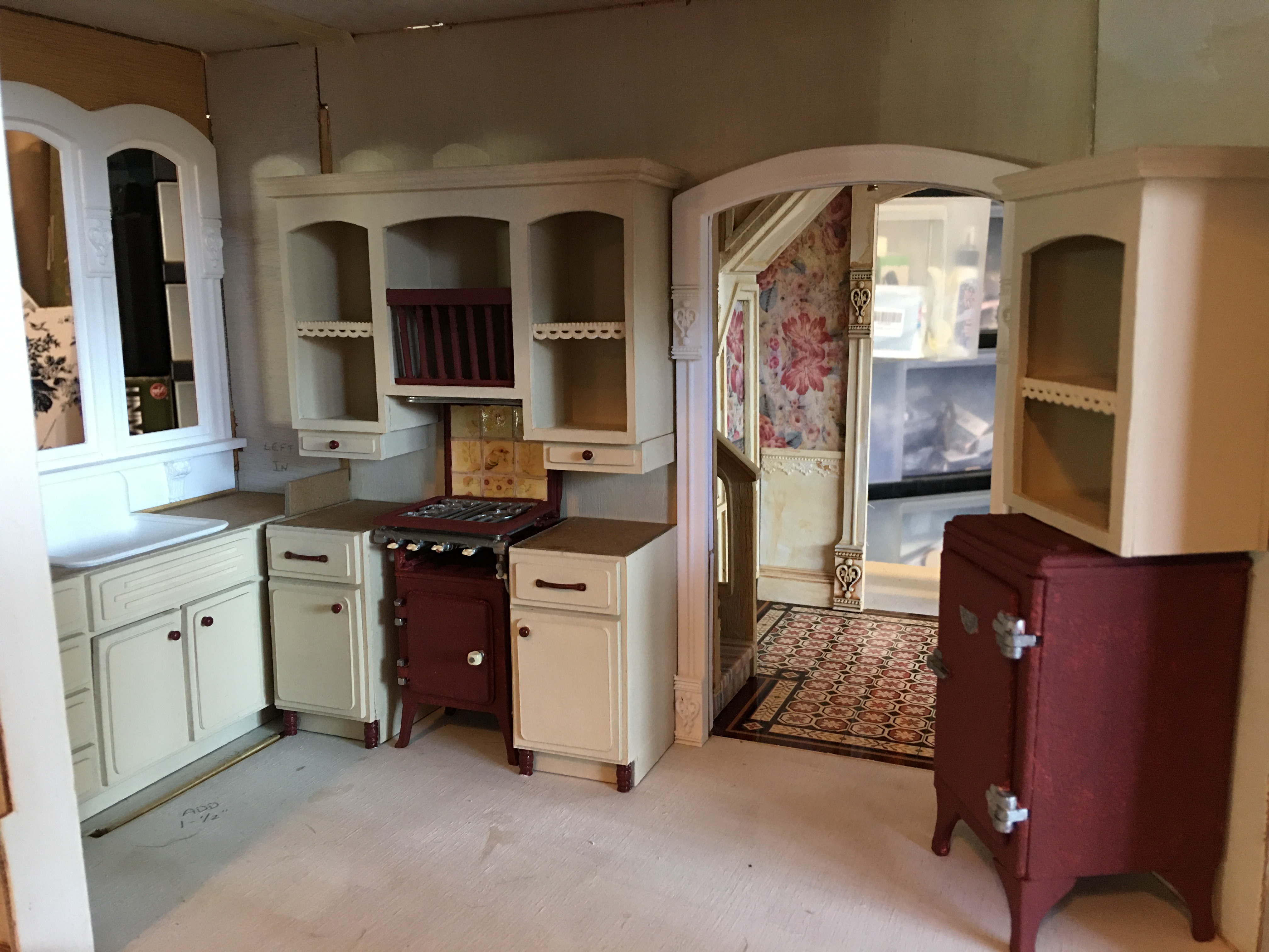
Once you add details like crown molding, lace shelf edging,
painted handles and feet, the chipboard cabinets really come alive!

The sink really has the right flavor profile for this kitchen. Here's a look after lots of sanding and glossy finish applied. If you were really determined, you could spend a long time sanding to make PLA look like real porcelain. The holes have been drilled for the taps and faucet, but the drain is part of the 3D printing process.


I made a wee strainer for the drain. It may be only 5/16" round, but it gives off big flavor!


And it fits perfectly into the drain, flush with the drain ring. I wish I'd had regular bronze paint instead of a paint pen so I could have gotten the whole thing painted. The paint marker's tip is too wide to get in there! Ah well... It still looks cute.


To make the faucet, I used a screw-base cup holder in "brass" as the spout, then a "brass" earring back as the aerator/nozzle. Gem Tac works great for gluing these tiny metal parts. It's a strong hold, plus you can clean it up after it has dried because it is like rubber cement (but with no odor). Sometimes your junk drawers have just the right ingredients.


For the taps, I had straight pins, spacer beads and earring backs on hand. They look great in retro kitchens!


This photo is taken with everything in dry fit to make sure it all works together. Each piece is just set in and on, so you have to ignore the crooked and just notice the "feel". It's only a taste test.

Countertops and backsplash are just set on for now.
Sink is not fully seated into it's holes in the counter or countertop.

I love how the sink looks with the beam of sunset light shining on it! So "film noir"! 


Here you can see a better visual of why I wanted to have a tall apron on the window, and why I needed to raise the window up a bit. The sink fits here perfectly, now.


For 1940's era countertops, I had my choice of tile, marble or Formica. I used illustration art board as the base, then made various shades of Moss Green to create a look that can be either marble or Formica. Just a dash of this and a dash of that and viola! Soup! I gave it metal edging in a color that matches the faucets, because 40's kitchens craved their metal edging.


It was imperative to have all of the cabinets in place so that I could make an accurate template for the tile floor. I painted more illustration art board in green and beige, then cut 3/4" square tiles. I am laying them on the diagonal, alternating colors in the field. For the border, I will use Barn Red tiles in some way. 

But that is for dessert, my friends! I bid you Bon appétit and I'll see you next week! I hope you enjoyed my recipe for a kitchen!

xo xo,
Jodi

Thursday, July 28, 2022

Customizing The Willowcrest Continues...

One of the most challenging rooms in the Willowcrest kit is its kitchen. It's a long, skinny room with little wall space and two doorways to work around. Though it's typical of older homes where kitchens were compact and not well laid out, I think it's actually part of the kit's charm. I've seen some super successful and adorable versions where the builder made the most of the original layout, I've seen radical remodels and I've admired versions from true pioneers who completely relocated the room. Having so many wildly different ideas to look at is inspiring, and the opportunity to make even mass produced kits into our own unique versions is exciting! I decided on a happy medium for my kitchen. It won't be big or fancy, but it'll have everything a little cook needs to produce delicious home cooking. And hopefully, it might be my version of adorable, too!

This sweet kitchen has been left as the kit intends.
Photo courtesy of Judy Evans, Pinterest

In Elaine's version, she not only extended the bay, she changed the back
left corner of the kit, removing the jog in the wall to create more floor space.
Photo courtesy of Simply Curious

Elizabeth (Studio E) swapped her living room with the kitchen, then created
a hallway with a door at the end which leads to a patio behind the kitchen. So genius!
Photo courtesy of Elizabeth.

Elizabeth's Astonishing Finished Kitchen - Incredible!
Photo courtesy of Elizabeth.

It seemed to me the most efficient way to gain some needed square inch-age was to simply expand the bay. I extended mine by a measly 2 inches, but it's just enough to add a run of counters with a sink under the windows. That leaves the long wall with room for a small stove with counters on either side. A good cook needs to spread out a little! No matter what I tried, all I could come up with for the fridge is to park it across the room between the two doorways. Maybe I can find a way to turn that into an advantage, somehow. We'll see!

Looking in from the dining room.

You can see my "expansion joints".


My grandma cooked delicious meals for a family of nine for many years in an
impossibly tiny kitchen. This space should do our mini folks nicely!

I like to use wood glue as caulking in all my cracks and crevices.
The tape keeps the glue from oozing out as it dries.

I was able to cut the plywood pieces I needed from the unused bedroom/bathroom wall. I cut 2" strips from the piece, then cut those to the lengths I needed. I laminated them with wood glue to the kit's original bay window pieces, adding slots and tabs to make things fit together squarely. I did not want to extend the footprint of the kit by too much for fear of making the facade look weird.

Kit's original kitchen bay pieces laminated onto strips I cut from
the unused bedroom/bathroom wall piece.

Future bathroom bathtub alcove will sit on top of the extended kitchen bay.

Stairwell wall is still in dry fit here.

For the interior kitchen window, I replaced the kit's wood frame the same way as the others: scan, turn into an svg then bring in to Tinkercad.


The kit has the bottom of the window opening at 3-1/2'. I wanted to raise it up a bit for the future faucet, and I wanted a design with a longer apron to accommodate fancy shelf brackets. I also wanted to have an inner trim so it looks like the windows can open.


Here's what it looks like from the outside, but the exterior frame and filler will fix it.


And speaking of windows, I was able to get the stairwell wall window installed, and the wall attached to the house. So much of what I did to the entry, stairs and hallway is impossible to see now, but it feels great to know it's there!


Thank heavens for abundant clamps!

I put a couple sconces in the stairwell. It'll have a ceiling fixture, too, once the third floor gets installed. Hopefully, they will be enough to provide a nice ambiance in there. Before I install the third floor permanently, I'll test to see if I need to add hidden supplemental LEDs. I don't want it too bright, just enough to be able to see the peek-a-boo views of it's features.


And here is about all you'll ever see of the hallway from the bedroom doorway...


This view will disappear once the third floor goes in.

And the entry with the stairs and wall attached as seen from the living room doorway. Once the side wall for the living room goes in, it will be difficult to get this view again....


You may have noticed that there's an archway cut into part of the stairwell wall. This is the bathroom's original exterior wall, but I took advantage of the extended kitchen bay to add a little arched tub alcove to the bathroom.


Here's what the bathroom space feels like with the alcove extension...

View without the bathroom/bedroom wall in place.

Just the bathroom's floorspace.

With the bathroom/bedroom wall in place...

"Efficient" but functional.

The tub alcove arch's frame will match the rest of the window and door frames in the house. With the exterior window, I am hoping to experiment with a stained glass or leadlight window using 3D printed leading. We'll see how it goes...


It should be large enough to fit a Chrysnbon sized bathtub.

If the leadlight works out, it will provide a little privacy for the bathers.

Toilet and sink placement are still being mulled over.

And here is a glimpse of what the exterior facade is shaping up to look like with the bay extension and the alcove...


I don't think it feels too obtrusive, but what do you think?

Next on the To-Do list is to make wall, floor and ceiling templates for the kitchen and bath. Would you believe I still have not settled on colors/papers/tiles/era or overall style yet? It's been so stinkin' hot here, though, I may just lie down in front of the fan and think about it until cooler weather returns!


I hope all my northern hemisphere readers are finding ways to stay cool! And that everyone is making  project progress in spite of all the challenges they are facing. No matter what is going on in real life, doing minis just makes you feel good!

xo xo,

Jodi