Search My Blog!

Use the Search box below to find keywords that you're looking for quickly and easily!

Search Feature

Wednesday, January 29, 2020

Pound Cake Logo and Window Decals

The tardiness of this post is credited to the significant challenges I had in front of me this week. But, as you can see, they have met their match and Pound Cake's name is officially on the shop!


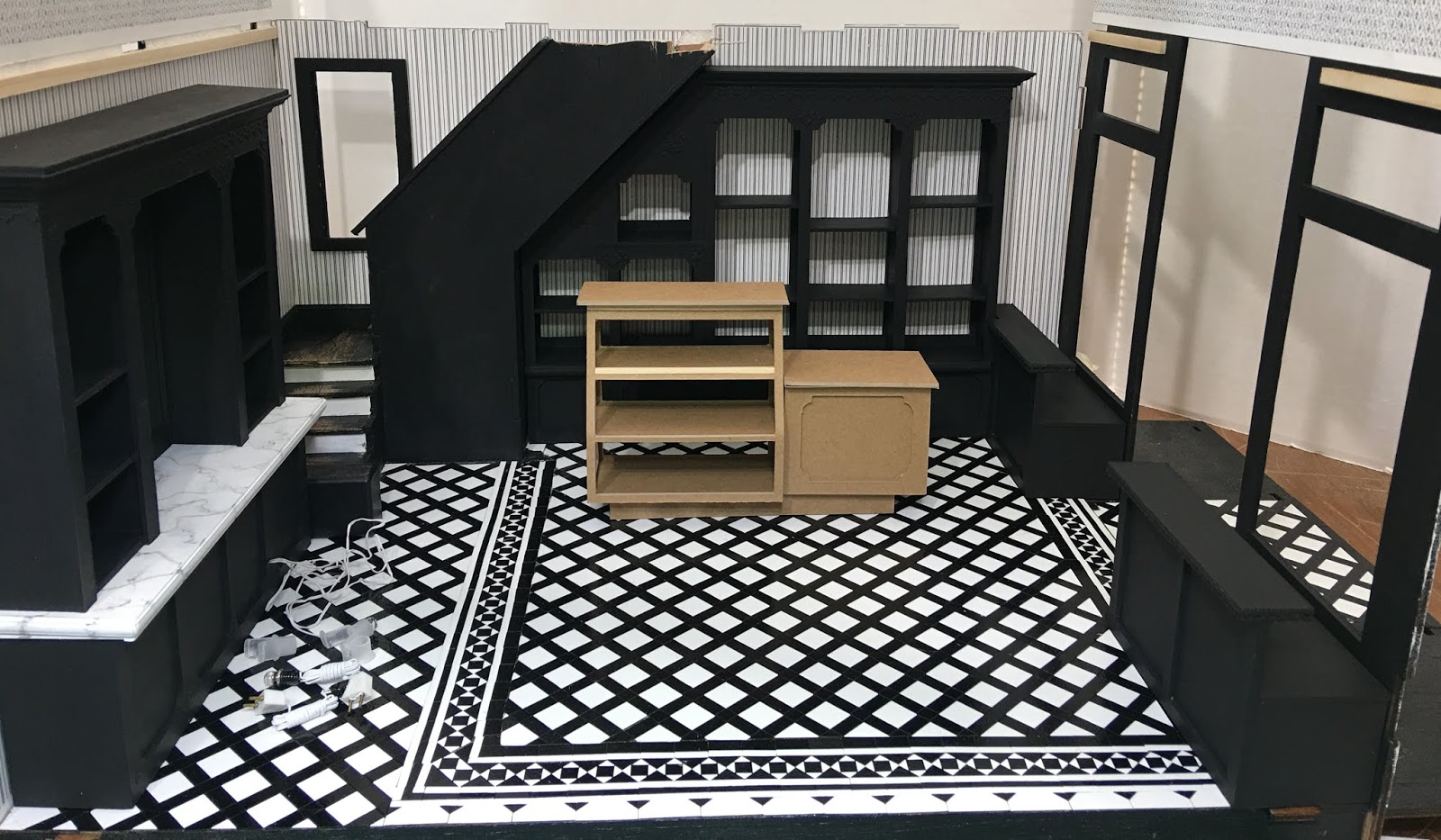
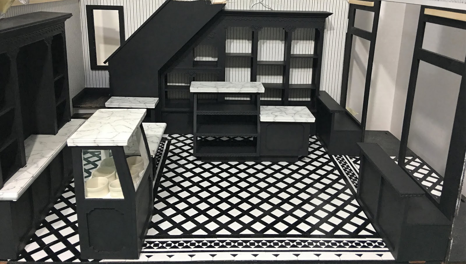
Getting the front wall installed on the Brimble's Merchantile kit became a little more complicated because of the fancy and much thicker coffered ceiling. I had to notch the side frames for the front door and dry fit them with the ceiling in place. Then, I could dry fit the door and window frames and begin the long process of installing them. This wall has to be completed before the ceiling can be glued in.


I sanded, painted then glued the interior window and door frames, deciding to go against the kit instructions and install the "glass" to the exterior of the shop rather than the interior. In fact, I decided to make my windows using 1/32" Lexan rather than the flimsy and very vulnerable acetate provided with the kit. How awful would it be to damage one of the weaker window panes after going through all the trouble to make them? Before I could get to that point, though, I had to make some decisions about front window decals...

I wanted to create an icon to use throughout the bakery on signs and packaging. Using Publisher, I combined shapes and lines to create a layer cake balanced on a tipping scale. The reason for the name "Pound Cake" will become much more obvious as the build moves forward.


I then imported that graphic into Cricut Design Space. I chose old fashioned lettering and viola -  Pound Cake's logo. These would be cut from vinyl and applied to the shop's front windows.


To see a great and simple tutorial on the entire vinyl process, click here:
Cricut Vinyl On Glass Tutorial

This photo shows the remaining vinyl after cutting and then "weeding" away the negative material. My little dots did not make it through the weeding process. They were so tiny and the backing paper so slippery that I had to finally, abandon them.


This photo shows what the vinyl looks like after the transfer tape has been applied on top. It's like packaging tape type material that picks up the vinyl. It comes on a roll so you can cut off the area that you need.


This is the decal applied with the transfer tape onto the pre-cut Lexan window pane. Trying to center it width wise and position it correctly vertically was a slow and steady process. I made sure to burnish it well with my finger to ensure the vinyl would stick well to the window.


When you carefully peal away the transfer tape it leaves the decal behind. This too was a slow and steady process.


To sum up my vinyl experience, I found that the Cricut cut these small and intricate letters perfectly. I did take the video tutorial's suggestion to select "more" pressure in the settings window for the cut. Even the tiny dots on the cake icon were cut well. They were just too delicate to remove cleanly from the backing paper. Trying to then reposition them by hand and keep them spaced right and level would have been almost impossible. Maybe with more practice I will learn a trick to make it easier.

Here is the window pane installed into the exterior frame and being glued to the kit's front wall. Because of the 1/32" thickness of the Lexan, the glue also acts as window glazing, filling in gaps which paint completely conceals in the end.


And in position. This whole "photographing black with a camera phone" thing is going to make me WORK!


Inside view of backwards lettering...


Here's one applied to the soda fountain back bar's mirror.


The entire vinyl procedure was delicate and fought with potential peril. BUT, as with most things in life, having a zen like focus and a surplus of patience made for a victorious ending! AND, isn't it fabulous that the Cricut has made lettering dollhouse windows a much realer possibility?!? Hooray for technology!

Now, with that same zen like focus, I intend to tackle that ceiling installation!
A little luck wouldn't hurt, either! Wish me some, will you?

xo xo,
Jodi


Saturday, January 18, 2020

Pound Cake Fixtures - A Week Of Discoveries...

This week, I continued my focus on getting the shop floor fixtures designed, cut, assembled and finished. I discovered that when Design Space is busy cutting, which can sometimes take a couple hours, I am able to open a session in another browser window to concurrently work on other pieces. This really helps make the most of my mini time. And now that my Seahawks and Russ' Raiders are done for the season, there will be less competition for my attention!


I also made another discovery. Cricut's 2mm chipboard isn't actually 2mm. That would be .0787 and some change. It is actually closer to .083. It doesn't seem like a lot, but it is enough to throw off your measurements when trying to make corners on fixtures meet up precisely. Lesson learned: Never trust the packaging and take your own measurements. I was able to re-cut some pieces with the Cricut and add trims, add to or hand cut and sand others. And I will be measuring every sheet in the future prior to designing new pieces.

Tip: If your measuring device doesn't have small enough markings, just stack the pieces until they reach a measurement that your ruler does have. Then use this conversion chart to find the decimal number. Then divide that number by the stacked number of pieces. This is the number to use in Design Space to account for the thickness of the material. Make sense? Or you can just buy a nice set of $30 calipers from MicroMark. :O)


I started with the built in shelves on what will be the right hand side of the shop from the front door and what will be the back wall looking in from the open "fourth wall". I split the space up in segments made up of the full height area from the end of the stair run to the front window and then the space under the stairs.


I further split up the work by making base cabinets and then the upper shelves. It made getting good measurements and the triangle's angle much easier.


Next were the front window display bases on either side of the double door entrance. I wanted them deep enough to provide plenty of space for displaying enticing baked goods. Each is about 4-7/8" wide x 1-7/8" deep. Plus I added another 1" wide shelf along the top. Double display space to tempt shoppers!


Here they are after painting - again with different lighting adjustments to help best see the details.


I also added the same bulb and socket wiring used in the back bar for each of the main shelves'/shelf's (what is the correct plural here?) top three sections to light up feature displays.


The next thing on the list was the bakery display case and cash register counter. I looked at a lot of designs for inspiration and came to the conclusion that simple was good. Just the raised profile created by the recessed toe kick should be enough character in the design. And in the end the baked goods will be the focus.


The ensuing piece to tackle was the ice cream freezer. My initial design loomed large in the space so I went back to rework the design. My one hard measurement was the six ice cream crocks that would have to fit into the unit. I economized the amount of space between and around the slots for them and was able to trim half an inch off the original design.


I sandwiched transfer film between two layers of chipboard panels for the "glass" and added LED lights to each of the cabinets (seen here powered by a 9 volt battery for demonstration). Just that little bit of saved floor space makes a difference. I will probably list the first prototype on eBay one of these days when I need to make space for a new project.


Next to the ice cream freezer there will be a soda fountain counter with two stools. I made that cabinet as well as a hot beverage station cabinet for next to the stairs. Speaking of the stairs, I took Betsy's great advice about removing the pony wall on the first flight due to the crowding caused by the back bar. It really did open the space up and for now I think it works left open.


There will be a couple cafe tables each with two chairs, plus at least a couple floor displays, but this gives you an idea on the layout of the shop area. Good thing I am a fan of crowded miniature shops!


For the countertops, I stuck with the faux marble look, adding 1/4" trim pieces to the edges of the chipboard to give the impression of thick marble. I achieved the look with several coats of white acrylic background sanded as smooth as possible then used soft charcoal pencil to make the veins. I used a soft dry paint brush to smudge and soften the veining and then finished off with several light coats of Krylon Triple Thick varnish sprayed on.


And here are all the pieces completed and in their likely places...


It seems like the next logical step is to get the front wall ready by installing the doors and windows. Then I can install the ceiling and begin working on the rest of the shop lighting. I'm both excited and nervous to see if the plans I have made in my mind for the look of the shop will work well in the real world. We'll discover that together, soon, I hope!

xo xo,

Jodi