Last week, I shared the process for 3D printing the appliances for the Beachside Bungalow's kitchen. This week, I'll share the process of designing and cutting the cabinet pieces using Design Space and the Cricut Maker. The least hope, even if you don't have a cutting machine, is that you find it interesting. The greatest hope is that it helps, in some way, for you to achieve your very own dream kitchen. Whether by hand or by machine, paper or wood, or even plastic.

As you all know by now, I start with the sketch. Using graph paper with 1/4" squares, I draw the kitchen to scale. Because the graph paper is only 8.5" x 11", if my room is larger (which it is), I tape a couple pieces together, matching the squares. Now I have a true representation of the space I have to work with on one wall of my dollhouse. In the Beachside Bungalow, that is 11-3/4" (29.21 cm) deep and about 9" (22.86 cm) high. If I'm trying to decide on a layout, I account for the space that the appliances will need first, and then see what space I have left for the cabinets. Seeing a visual really helps me to end up with a symmetrical layout, no matter how large or small the space.
 |
| Scale sketch of the right kitchen wall. I much prefer deep drawers to cabinets with shelves for any kitchen. No stooping or reaching! |
Once I have the drawing and the overall measurements, I can begin to work up on paper the pieces and precise measurements of each cabinet that I will need to create. I have an idea about how they will go together by asking questions: Do I want the sides to overlap the back to hide my seams? What is the exact thickness of my material (in this case chipboard)? Where will I need support pieces? I either imagine or draw how the pieces will fit together so I know where to subtract material thicknesses. This allows me to stay within the overall width, depth and height. I assign a name to each piece that I'll remember, then I create a "cut sheet" with the measurements. The quantity that I need of that particular piece is placed at the beginning of the line with a circle around it.


Since I am sticking to true 1/12th scale, it's important to know a few things about the standard measurements in real life kitchens. For example: What is the standard depth for upper and lower cabinets, how wide are appliances, how far do countertops overhang the fronts of cabinets, how far above the lower countertops do uppers get hung and how tall and deep are toe kicks? Once I know these measurements, I can convert them to 1/12th scale. I'll need the decimal numbers to create the pieces in Design Space. Here is a link to convert fractions to decimals.


In Design Space, I start with a square from the Shapes menu. I unlock the aspect ratio, then set the width and height to my needs. Ever assemble flat pack furniture from Ikea? This is just reverse engineering.


You'll see that some of my measurements in the above cut sheet are color coded. Those are then coordinated in the Design Space program. This is because I often need to cut several sheets due to the 10.5" x 10.5" limitation on each 2mm chipboard sheet. Color coding helps me to organize my pieces all through the process, and allows me to group them together so I can control what cuts where on each sheet. It would be a great feature if Design Space would let you label each piece in the design screen. It would be so helpful to those of us with complicated jobs and a whole lot of pieces to keep track of! Plus, you could print out a screen shot to use as a key when you assemble them away from the computer.
 |
| Color coded in Design Space. |
 |
| The pieces cut on the sheet exactly how I assign them. |
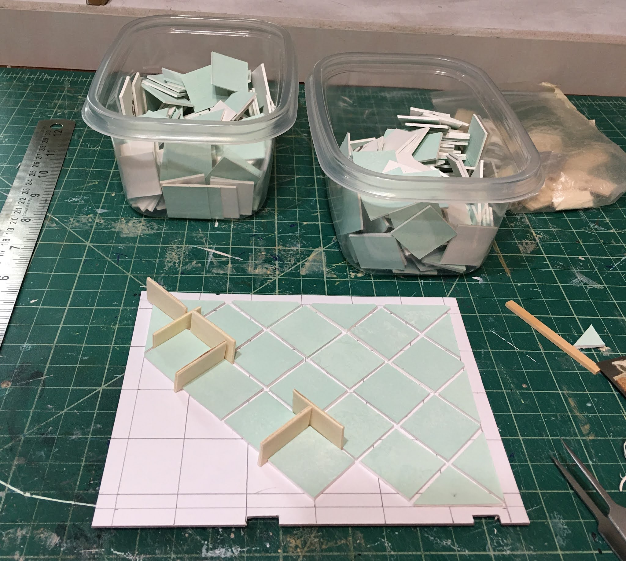
Cutting can take several hours. Each piece of 2 mm chipboard receives 24 cutting passes. Once the cutting is finished, the assembly process begins. Keeping your pieces organized is essential so that you don't get confused and glue the wrong pieces together. I leave them on the mat until I am ready to assemble those pieces. You can also label them in pencil. Dry fitting is a must, and you may have to cut corrections or additional brace pieces once you see the design going together. I use wood glue in a bottle with a small nozzle to glue my cabinets. I find that the thin consistency makes for a cleaner job.
 |
| "Caulking" the seams with glue where they won't be seen or interfere with function adds great strength to the piece. Add a thin bead of glue, then run your finger along the joint smoothing the glue and removing excess. Just like real life caulking! |
 |
| The drawing helps me to remember my intentions. |
Some crafters seal their chipboard edges with CA glue. I have found that not to be necessary. I apply several thin coats of regular acrylic craft paint, lightly sanding between, with great results. My first chipboard cabinets, made in early 2016, are still in perfect shape. CA is messy if you are not extremely careful, can create a rough surface requiring sanding, is hard to clean off fingers and may also give off harmful (and invisible) gasses which are not good to your lungs. That's my experience, but feel free to take it for what it's worth to you. :O)
Now comes the hardest part! What color? I narrowed it down to two shades of green which I matched and pulled from the chevron wallpaper: Sea Glass (left) and Mint Julep (right). I liked them both so much and kept vacillating between the two. Finally, I painted a chip and took several photos with them against the walls.
 |
 |
| With the floor tiles. |
 |
| In the light. |
 |
| In the shade. |
Although the Mint Julep was such a pretty, soft green, I liked that the Sea Glass had a little blue to it. I reasoned that this would allow me to cohesively toss another color family into the design when it's accessory time. And I'd be able to use the Mint Julep to paint some of the kitchen accessories.

Once they were painted a few times, sanded in between and had their pulls installed, I was happy with my choice. I think they will make a nice backdrop and allow all the kitchen things and colors to stand out.
The drawers open but the closed cabinets do not. Pin hinges and chipboard do not make good bedfellows. So why do I choose to use chipboard instead of wood when the Maker will cut either? Because the Maker can only cut wood which is less than 1/16" thick (1.5 mm). This is fine for furniture, but I have found that with cabinets or large pieces, thin woods tend to warp or are especially vulnerable to breaking when sanding. And the chipboard is more in scale and cost effective. When I can machine cut in 2mm or above thicknesses, I will likely return to wood cabinets and make them all open. That is also why I went with open cabinets - I like to see all the pretty kitchen stuff!
 |
| Uppers just resting on the lowers. |
With the cabinets ready, I could turn my attention back to the finishing details on the 3D printed appliances. There was a little sanding and assembling to do before I was confident that they were really going to work. Here's how the stove/oven went together...
 |
| Oven interior to be painted with Zinc. |
 |
| Visible stovetop areas painted with Zinc. |
 |
| First, adhere the frame to the stovetop. I used Aleene's The Ultimate contact cement. |
 |
| Next, center the gas hobs and glue. |
 |
| Finally, the burners. The photo with the knobs attached is coming... |
 |
| Main box, top, door front, fan housing, food plate and spinner. |

 |
| "Glass" affixed on the door first... |
 |
| Then the "radiation blocking metal screen". |

 |
| Ignore the medicine cups. :O) |
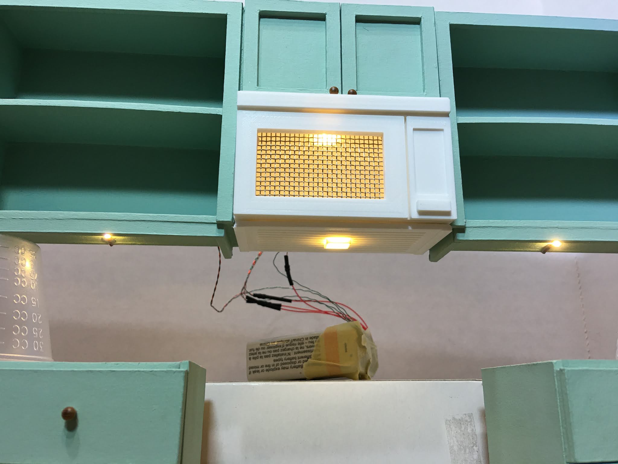 |
| Stovetop/fan light and under counter lights. |
 |
| Ignore the medicine cups. :O) |

 |
| Oven interior light. |

Now that the right side of the kitchen was pretty well in hand, I could begin working on the left side. The plan was for it to be comprised of an island which would house the sink and dishwasher, a dummy under sink cabinet, opening drawers and dining space for three stools. I created it in the same way as the other cabinets, making a scale drawing and then using that to create a cut sheet for the chipboard pieces.

I decided that since Kairi is an artist, and already has shown her preference for her home to have some character, she wouldn't want matchy-matchy kitchen cabinets. So for the island, I went with the mint julep paint color. It's such a pretty green!
 |
| The dishwasher will cover the unpainted area. |
 |
| The back and sides of the island have detail trim. There will be a 1-1/2" overhang of the countertop from the back with space for three stools. |
The fridge was made from a styrene kit that Model Builders Supply used to sell. I've had it in my stash for years and I don't think they make them any longer. It is totally non functional, and my intention is for it to remain a stand in until I have the time and brain power to create a 3D printed and functional model. It was perfect for this kitchen because it is compact and white to match the other appliances.

Now that the cabinets and appliances are ready, I'll have to decide on countertops. Remember how I did the vanity counter for the main bathroom? I loved the way they came out and really considered going with that style for the kitchen. But is it the right look for this kitchen? Somehow, I think Kairi would prefer to have simple, light colored butcher block counters.

While I contemplate, I'll continue playing with accessories on the 3D printer. Here's what I've got designed, so far...
 |
| K for Kairy, canisters, plates, plungers, tp & towel holders, faucet, Keurig, "K-Cups", coffee mugs and toasters. |
And here are a few of them after printing to test out in the kitchen for scale. A few more tweaks and I think they'll be great!

And that is the end of a very long winded post! Thanks for sticking with me, and a ~Hearty Welcome~ to all the new followers! There is no better priviledge than the opportunity to inspire and encourage one another in our mini passion!
xo xo,
Jodi