Search My Blog!

Use the Search box below to find keywords that you're looking for quickly and easily!

Search Feature

Thursday, August 25, 2022

Let Me Reiterate

You know how it took me a couple tries to get the floor tiles "right"? Compared to other things I'm working on, only two tries seems lucky! For the Willowcrest's wee kitchen chairs, ultimately, I wasn't satisfied until the seventh try!


The first thing I needed to do was to get a feel for 1930's and 1940's kitchen furniture styles. I perused Google and collected the photos of tables and chairs that just spoke "vintage" to me. There were things I liked about each of these pieces in the photo below, and using the knowledge, tools and materials I have available to me, I thought I could probably come up with something close.


Once I had a picture in my mind of the features I liked in the chairs, I needed to get some measurements. I brought out several of the chairs in my stash so I could get a feel for size. The chair on the left is Town Square Miniatures, the one in the center is Chrysnbon and the one on the right is House Of Miniatures. What it demonstrated is that the size of mini furniture varies widely. As long as the seat height was pretty close to the standard, around 1-1/2", the rest of the design could be fitted to my space and table.

If there are any James Bond fans reading this, you may laugh or cringe
at the cane seat being removed from the middle chair. 
Casino Royale was the movie. Le Chiffre was the perpetrator. OUCH!!!


Next, I turned to Tinkercad where I could create a design, print it out, assemble it and then make incremental improvements until I ended up with something that fit my criteria. I wanted a chair design which produced a consistent print quality, that assembled easily, and looked similar to many of the 30's and 40's style chairs that I liked. Most important, it had to be cute! I love the double arch design, and it just goes so great with all the other arches in the Willowcrest!

Many iterations and assembly configurations to test.

The final design.

Now that the design and print process were good, it was time to compare my chair to the others in my stash. I eliminated the HOM right off because it was noticeably tinier. But compared to the Chrysnbon and the Town Square chairs, mine worked!


While my trusty X-Max was printing many chairs (at just over 2 hours each), I was working on the table. I decided to design the table in Design Space and cut it from chipboard with the Cricut Maker. 


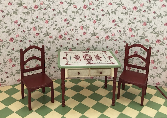
I was so engrossed in the table's assembly process that I forgot to take photos! Essentially, the table is comprised of a chipboard box which holds two working drawers on either side and a "porcelain enamel tabletop". This was a common material for that era, and I really loved the look. I made trim pieces to overlay the chipboard from kraft cardstock to add a layer of art deco detail. I combined several graphics to create the tabletop design, then used the Print Then Cut feature in Design Space to cut it from regular printer paper.. The table legs are standard Houseworks legs that I had in my stash. I painted the table elements in a mixture of the kitchen's colors, and applied the graphic to the table top with Mod Podge. I did not brush Mod Podge on top if the graphic because of the way it made the wallpaper's printer ink smudge previously. Instead, I spray sealed it with satin varnish. It shows wear on the drawer fronts, and might get a little more scuffed as I age the kitchen cabinets. The most pleasant surprise was that I only had to make the table once!


I used an amalgamation of 30's-40's table measurements I found online, and also factored in the space I had to work with in the Willowcrest kitchen. Here is how it worked with the test chairs, and then with my chair.


I really like the vintage feel and it works as well as you can hope for in this compact little kitchen!


The chairs definitely need some "cushy for the tushy", so I'll make the cushions when it's time to dress the room. For now, it's still too hot to wallpaper, so my mini time will be spent on the PC. At least here, I can sit in front of my Hot Flash fan and design the accessories for my little home cook. I have some fun stuff to share with you next week!

Hope you're finding ways to stay comfortable while working on your projects, too!

xo xo,

Jodi

Thursday, August 18, 2022

Second Time's The Charm

I knew that I wasn't going to be able to live with the first attempt at my encaustic tile floor for the Willowcrest kitchen. I did such a poor job, and this project deserves better! My next attempt still isn't exactly perfect, but I think the second try is going to be the charm. The four year old is very happy!


My wood did not arrive as I'd hoped. In fact, it was supposed to be here by today (at the latest). It has a UPS label, but as far as I can tell from the tracking, at the time of this writing, it hasn't even left the seller's shop yet. So, Plan B was to cut the 3/4" x 3/4" main body tiles from illustration art board using the Cricut Maker. Unlike me and the mini table saw, it did an amazing job! I had room to cleanly cut 99 tiles from one 9" x 12" board. I took that as a sign that we were about to embark on a very pleasant journey. In our optimism, the four year old and I sang "99 Bottles Of Beer On The Wall" as we worked.


TIP: I like to use my old Cricut mats to cut heavier materials. Once they lose their stickiness, I use dots (every few inches) of Aleen's Tack It Over & Over to help hold the material in place. Any material that I have to use the knife blade for, I automatically use masking tape on the edges, as well. The Aleen's adhesive removes easily by simply rubbing your finger across it. It comes off like a sticky booger, so have something handy to wipe it onto. There is nothing worse, in the middle of a cut, than having the Cricut stop because the knife blade jammed. This step prevents that.

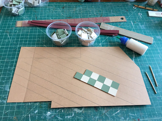
I learned from my mistakes with the first floor, and this time, used the proper method to set the first tile: Find the center of the floor by measuring the height and width of the floor template. Divide each of them by 2 and make a mark. Using those marks, draw a line down the center from the top to the bottom and one side to the other. Where the lines intersect is the center of the floor template. The first tile should be laid there, whether laying diagonal tiles or not. If laying a diagonal pattern, line each corner of the tile up with the center lines on the floor. If not laying a diagonal floor, align the middle of each side of the tile with the lines on the floor template.

First tile is set exactly in the middle of the floor template.


My tiles did wander a wee bit, but it was not because of uneven cuts this time. Whether by the user (me) or that the kitchen floor is not perfectly square, I do not know. But I can live with this degree of imperfection.

Main kitchen body tiles.

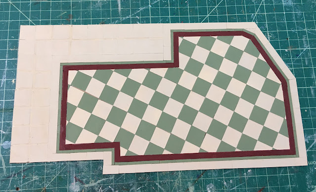
Here, I am beginning to lay the first border tile. I had the wood on hand for this part of the floor design. It is 1/16" x 1/8" basswood. On my first floor, I cut and laid each individual tile. This caused the tile line to wonder a bit. In this floor, after I had laid the strip, I scribed in a tile line, using my Xacto blade. I began in the center and scribed each consecutive line every 3/4". The next row of tiles were offset to the middle of the tile above it. It looks much more consistent and you can't tell the the tiles aren't individually laid. 


Here I have added a red border with the same 1/16" x 1/8" basswood, scribing the tiles in the same way.


And the final border tile is green but in 1/16" x 1/4" basswood. The area where the tile pattern is laid straight will be under the cabinets. You will see a bit of it under the stove, but I hoped, being different, it might add interest.


I had an idea to use wood floor paste wax to seal the floor. I thought it would be fun to do and would create a very shiny, smooth surface. Unfortunately, my test piece didn't turn out like I'd hoped. Warning bells were sounding, and unlike with the first floor, I listened to them. It may have turned out fine with many, many coats and much buffing, but I didn't want to take the chance, end up ruining it, then have to make a third floor. Ultimately, I used several coats of Krylon Colormaxx clear satin spray varnish.


Look ma! No gaps!


Finally, it was time for the finished floor's test fit. It is so exciting to reach this point, at last!


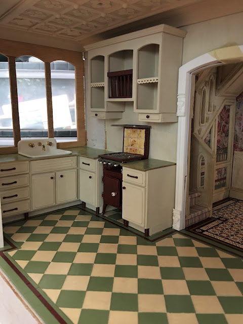
I had to load in some of the cabinets for a dress rehearsal. You can see the straight tiles under the stove. The border tiles and edges seem to be lining up pretty well...


How about the sink cabinets? Those seem good, too! By golly! I think it might be time to start installing all of the elements of this kitchen! 


A little wear and aging might be called for first, though I hate to do it! Here's where that little voice argues with me to leave well enough alone. Maybe I'll start very slowly and see where it leads. It would sure be nice if the first time was the charm this time!

xo xo,

Jodi

Thursday, August 11, 2022

Win Some, Lose Some, Try Again...

Last week, I left you with a sneak peek of the tiled kitchen floor that I was working on for the Willowcrest. I was laying it on a floor template made out of kraft board. I believe I even called it dessert? Well... Let's just say it didn't turn out so sweet...

It started off so promising!

I did follow all the way through with it, but I debated with myself about starting over many times. You know how part of you just wants to be finished with something, so you tell yourself it's good enough? Yet, there's this other (nagging) part of you that will never be satisfied because you know you could have done better? That's my struggle. I know I will end up redoing it, I'm just waiting for the four year old inside me to quit throwing a fit about it. And, I'm waiting for my wood supply to arrive.

All the white space is the under the cabinet area.

What's wrong with it, you ask? Well... If it's not already glaring at you, I will give you the long answer. Are you ready for a story?

You may want to grab a snack... 😉

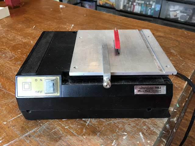
All the trouble started when I tried to set my mini table saw on fire...
Now there's a headline!


You see, the blade was wearing out while I was cutting the plywood for the new kitchen bay extension. I did not have another 80 tooth blade on hand (yet another long story. They are $29.99 and only available at MicroMark. Add their minimum shipping of $9.99, tax, and now you have a $45 blade. I only order them when I have enough in my cart to justify the shipping charges). 

All I had on hand was the 100 tooth blade for very fine cuts. That does not work well with 1/8" plywood. So, having only eleven inches left to cut through, I just kept using the dull blade. When a blade gets dull, it gets hot by being overworked as it tries to cut through the material. 

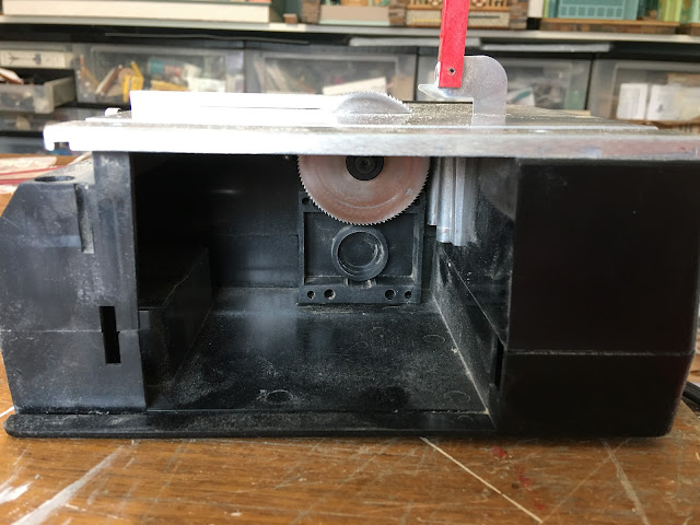
Sawdust and blade compartment.

See the compartment in the above photo? Do you see the bottom of the saw blade? A lot of the sawdust goes in that compartment, sharing space with the blade. A hot blade + sawdust = fire. Well, it could catch fire. For me, luckily, it was only smoke. There were no actual flames, thank my angels! But there could have been. Fortunately, I finished the cut for the bay walls before combustion occurred! Lucky, lucky, lucky!

I cleaned the compartment and changed the blade to the 100 tooth. That would have cut like butter through basswood, but I was out of the wood I needed. The next best material I had on hand to use for the tiles was illustration art board.

To avoid making all those cuts by hand (which I know I am not precise at), I thought I'd use the saw with the rip guide set to 3/4". I could rip 3/4" strips, then cut the strips into 3/4" individual tiles. Sounds reasonable, right?  Unfortunately, the blade did not seem to work well with that material at all. The cuts weren't clean, the blade (which has always had a little too much side movement, causing tolerance issues) wanted to bind (scary when your fingers are that close), and it shot paper particle cannon balls in my face! Ever had a spitball facial? It's like sandblasting your face. I don't recommend it! 😣

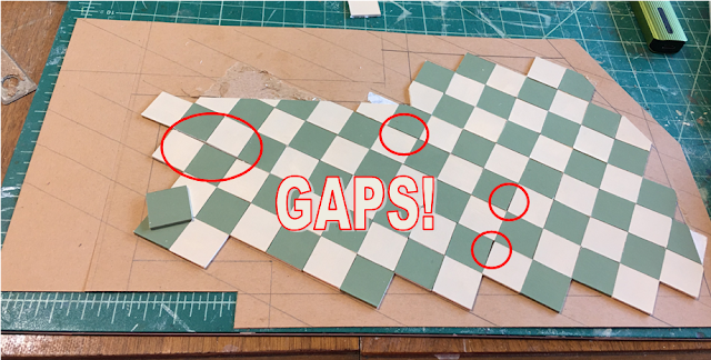
But, like the plywood with the dull blade, I carried on. The results were tiles that were not always square. I think, out of pure stubbornness, I laid them anyway. This, of course, lead to part of my dissatisfaction with the floor. It left gaps, but I kept telling myself that you'd hardly notice when I got the wax applied. 🙄

🙄🙄🙄🙄🙄

As if that wasn't bad enough, the orientation I set for the diagonal tiles was just wrong. Instead of squaring the room and starting the diagonal in the center, I drew a line from one corner to the next and then followed it. Because of this error in my method, all of my edges end with unequal tiles - a really sloppy looking job. I also came up with a better idea of how to do the borders, after I'd already gotten a lot of the red border finished. But did I ever halt at any of these warning signs? No. When I mess something up, I really do a good job at it! So, the floor is awful and I am dangerous with tools.

This concludes our tale of How To Really Screw Up A Tile Floor And Live To Regret It. The moral of the story is: Listen to that little voice telling you to stop. It might save you time, material, frustration and embarrassment. It might even stop you setting yourself on fire. 😒

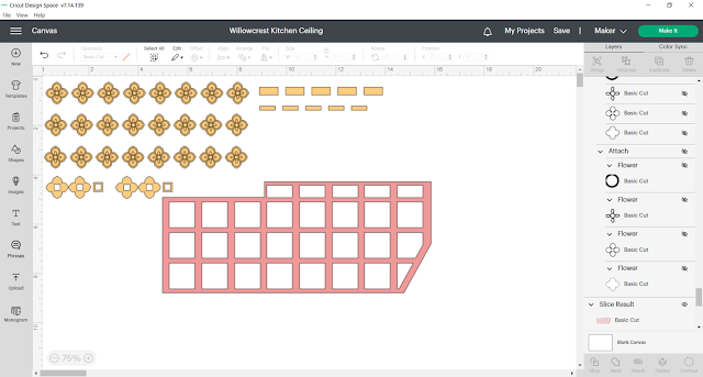
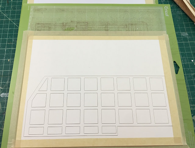
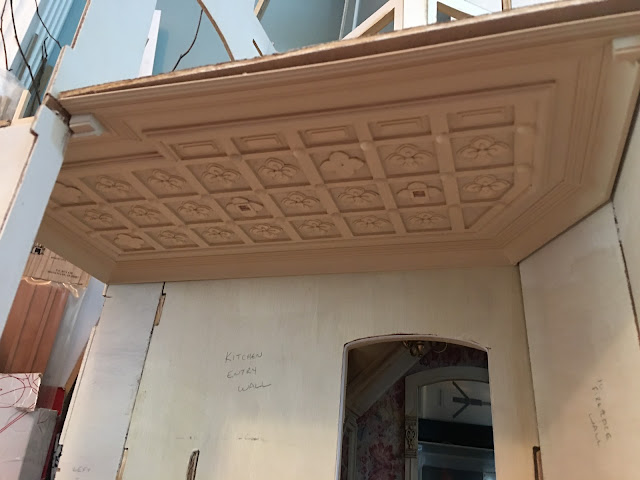
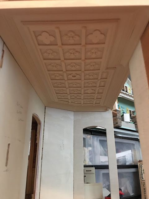
Meanwhile, while I was letting the four year old throw her fit in the background, I had gotten started on the kitchen's "tin" ceiling with much more satisfying results. I made the design up in Design Space and let the Maker do my cutting for me.


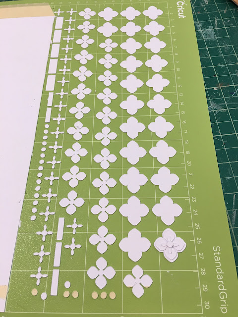
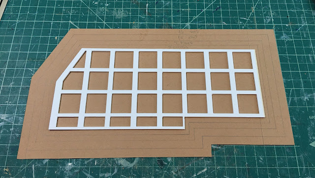
The grid that creates the recess was cut in illustration art boards (perfectly), and the four layer flower pattern for the recesses was cut from kraft board. I should have let the Maker cut my floor tiles for me! 🤪

The flower design is made up of four layers.

After cutting I just assembled the layers.

Close up of layers.

The "waste" squares could have been my tiles!!! 🤪

It was a pleasant surprise when the graph paper pattern I made for the kitchen floor worked perfectly as the pattern for the ceiling. The grid fits in the center of the pattern, which is cut from more kraft board, and the space around it will be filled with trims.


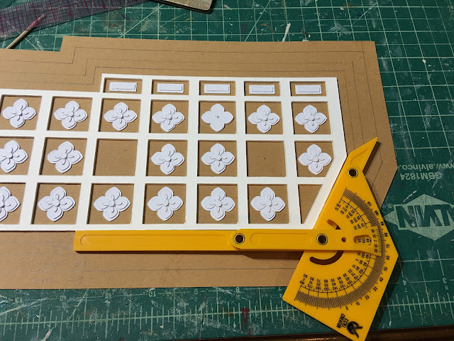
Here, I have filled in most of the squares with the layered kraft board flowers. I am getting the angles I need to cut using my angle finder. My geometry teacher must be up in heaven somewhere screaming "I told you you'd need to know how to use a protractor!". If she'd only told me it would come in handy for dollhouses, I'd have probably taken her more seriously! Luckily, if you were daydreaming during geometry class like I was and need a refresher, we now have YouTube! 😁


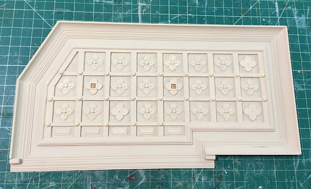
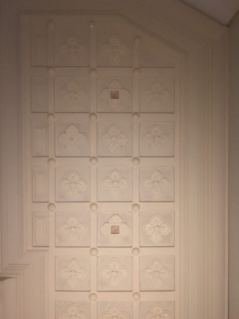
The photo below is the ceiling with the center grid completed. The three squares with only two layers of the large flower shape are where pendant lights will hang. The two squares with the square holes in the centers are where recessed lights will go. I have added cove molding around the edges, a stepped molding against that, then stacked a plain layer and chair rail molding around the grid. My angle measuring and cutting was not precise, so I have been aided by wood glue caulking to help conceal any gaps. I added the half pearls to the intersections to add another layer of detail.


It seemed like in a house that is at lest 60 years old, the original tin ceiling would have probably been painted over a few times, so, I decided to paint it in the trim color I'm using in the rest of the house. It looks so nice with a couple coats of paint, and it turned out even better than I had envisioned! It makes me feel a little bit better about screwing up the floor. 😊


And here is the test fit in the kitchen. I just love it! I can't wait to see it with all the other kitchen pieces!


A happy ending for the ceiling!

There is a bit of an epilogue to the saw story...

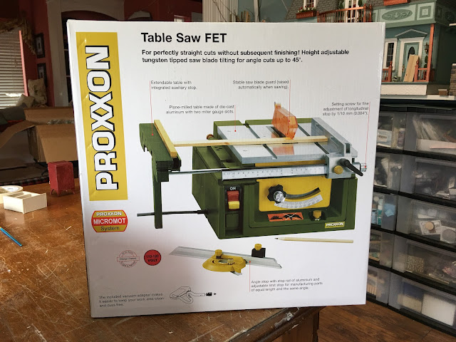
When I told Russ what I had almost done to my mini table saw, I thought I was going to be in big trouble! Instead, he bought me a better and way more capable saw. And, he told me to order the wood supplies that I needed and to get extra blades, too. He's quite a wonderful partner to go through life with! 💗

Once I get it all set up and practice a bit, I'll give the four year old a popsicle. Then we'll try again with the tile floor. Maybe this time, we'll love it as much as we do the ceiling!


Just like in real life, with minis, sometimes you win some, sometimes you lose some, but you always try again. Keep trying until you love it, my friends!

Hopefully, back next week with a flooring success story, or at least some kind of progress!

xo xo,
Jodi